Context
Syntra
Designing an EHR Patient Screen for Syntra
This is a design assignment that I undertook as a part of application process for the position of UX & UI Designer at Syntra. No NDA was signed, and thus, I wanted to showcase my process of designing a dashboard screen for Syntra.
Syntra's core value proposition is AI transcribing and the platform is built for solo healthcare practitioners.
Overview
Challenge
Re-design a screen of your selection from our current portal.
Outcome
I designed a screen's UI for Syntra following healthcare design regulations and extensive research.
Info
Role
Job Applicant
Duration
2 Days
Tools Used
Figma, FigJam
Design Process
How I went from 0 to 1 within two days.
Hours 1 - 8
Researching Healthcare UX
I read 4 research papers, and reviewed HIPAA, HITECH, CCPA and The Cures Act to establish a set of guiding UX principles. I also looked at research that provided me with a user journey map and a user persona for the screen I re-designed.
Hours 8 - 12
Rapid Prototyping & Testing
I created initial wireframes in Figma, iteratively making changes to them based on the feedback provided by a family doctor I had access to and a user persona.
Hours 12 - 16
High-fidelity Mockup
Once the designs were finalized, I utilized Figma to create a high-fidelity mockup flow for it.
Research
Establishing Design Decision Making for Healthcare UX:
Findings & Insights
Common Usability Issues within Current EHRs
According to Sipanoun et al. (2022), the core experience-related challenges in EHR systems include: a. Increased cognitive load due to information overload, b. No handling methods for downtime, c. Inconsistent EPR terminology. This provides an opportunity to increase workflow efficiency, which is one of the goals of EHR technologies.
According to u/kcayz (2024) & other collaborators pursuing medicine (current students and recent graduates), a lot of EHRs are deemed “unintuitive & clunky - like designed in 90s and never updated!” While there are other opinions, on the subreddit, the former is most mentioned. It is assumed that this is due to information overload and increased time-on-task for reaching the PCP’s goal. This assumption is made based on other collaborators on the post.
Some other issues consist of data entry errors due to unclear labelling or workflows, overlooked specifics of the clinical setting - such as emergency scenarios where an inflexible EHR workflow could result in loss of life, designing EMRs for multiple roles within multiple settings.
These can be combined into a list by order of priority:
1. Complex Interfaces, increasing user’s cognitive load, increasing time on task.
2. Unintuitive tags, content strategies, nomenclature, increasing user’s cognitive load, time on task.
3. Inflexible EHR workflows, resulting in system-caused delays during life-threatening situations.
Lawful Considerations: HIPAA, HITECH, CCPA & The Cures Act
HIPAA, HITECH, CCPA, and The Cures Act establish the following guidelines for EHR Interfaces:
Audit Trails:
The UI should provide clear logging and audit capabilities to track who accessed or modified patient records.
Access Control
Implement role-based access controls to ensure only authorized personnel can access patient data.
Data Transparency
Include UI elements that clearly communicate data usage, such as consent forms and data-sharing agreements, ensuring PCPs comply with CCPA regulations when managing patient information.
Information Blocking
Avoid any design choices that restrict patient data access or prevent information exchange between healthcare providers. Allow easy sharing of EHR data with other clinicians.
Usability
Design the dashboard to be intuitive and easy to navigate, as poor usability can lead to unintentional information blocking by providers.
Visual Cues
Use alerts and warnings to flag compliance issues (e.g., unauthorized access attempts, missing consents).
Data Minimization
Limit the amount of sensitive information displayed by default. Avoid showing PHI unless necessary.
Meaningful Use
Include features that align with meaningful use standards, such as patient summaries, lab results, medication lists, and care coordination functions.
User Scenario: Supporting my Imagination of Use-Case Context
"Imagine a doctor rushes right into a patient’s room, geared up to speak about their concerns. But as opposed to focusing on the patient, they’re combating an EMR system that is clunky, confusing, and time-consuming. Due to this, frustration mounts, the session drags, and precious time for patient interaction is lost."
This situation, unfortunately, plays out way too often in healthcare settings. EMR software, supposed to streamline patient care, can inconsistently restrict it because of bad user experience (UX) design.
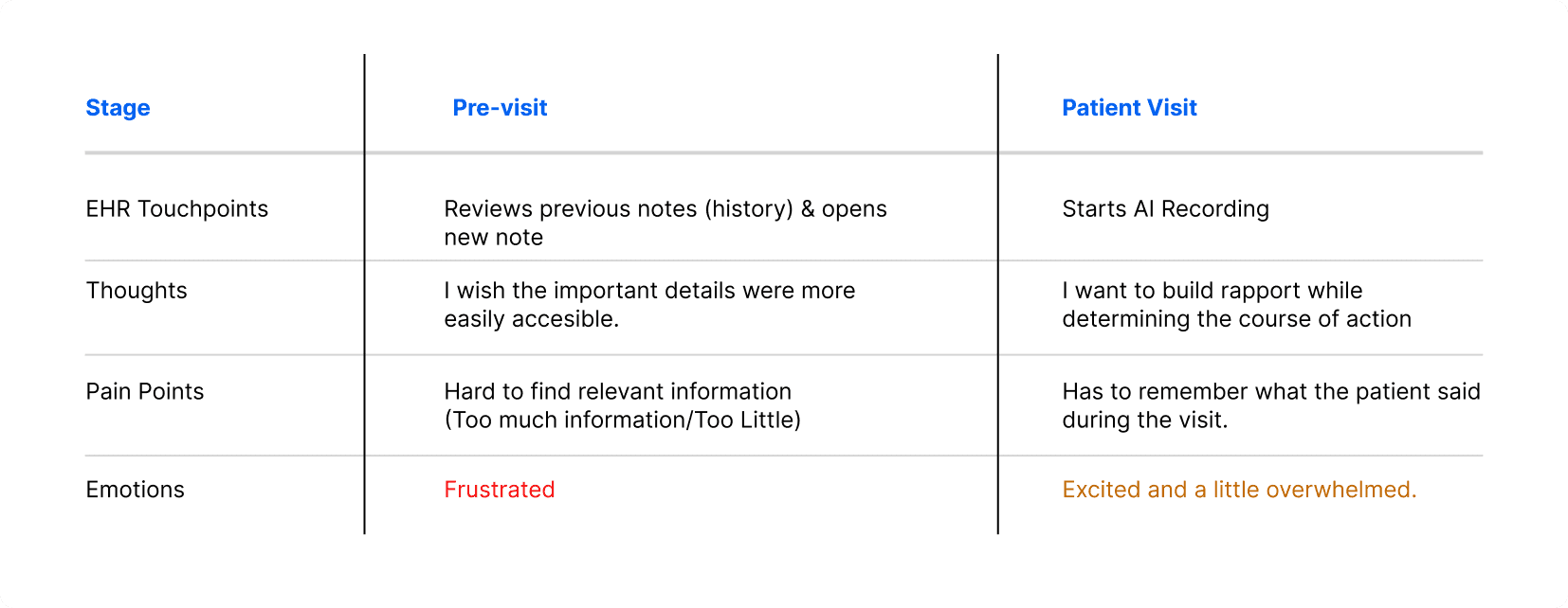
User Journeymap
This map is derived from and assumed as a primary user journey for the above journey based on Gao’s (2024) publicly available research; helping me better empathize with the user.
User Persona - PCP Stand-in
Ref: Gao et al. https://pubmed.ncbi.nlm.nih.gov/38646110/ (Apr 2024).

WIREFRAMING
Creation of the Mid-fidelity Screens
Wireframe Iteration 1: Setting the Base Structure
A few key decisions made here were the location of the navigation bar, the primary CTA & the patient’s profile location.
Side/Vertical Navigation Drawer
The vertical navigation drawer clears space on the top, and reduces cognitive load for the user. The drawer is collapsible, allowing for more utilization of the available space.
Highlighted CTA
The CTA aka, Start Listening. Is highlighted. Based on user research, usually the users are cognitively loaded at this stage. A larger CTA area or indication follows fit’s law for faster time-on-task.
Iteration 2: Adding basic components, and layouts
A few key decisions made here were: adding icons to navigation list icons, adding a patient summary tab - which is similar to history, and ensuring that the doctor lands on this page rather than today’s note. This was a minor usability flaw in Syntra's portal.

Iteration 3: Testing & Iterating - And a New Idea!
On showing the previous wireframe to a family doctor acting as a user, they mentioned a dislodge between alerts & patient summary. Along with this, on re-checking the information architecture as perceived through the demo, I realized that alerts could be a part of the patient summary.
I used the freed up space to show live transcript history - when the AI is listening, this allows doctors to search through the conversation history if needed, aiding through distributed cognition and optimizing cognitive recall.
Iteration 4: Experimenting
This was an exploration of the idea I had in mind. I grouped together the live transcript & the CTAs. The problem I was tackling was that in the previous screen the CTA and the transcripts were dislodged, and could be perceived as two different sections, slightly increasing time to comprehend for doctors and making the interface less intuitive.

Iteration 5: Eureka! The New CTA
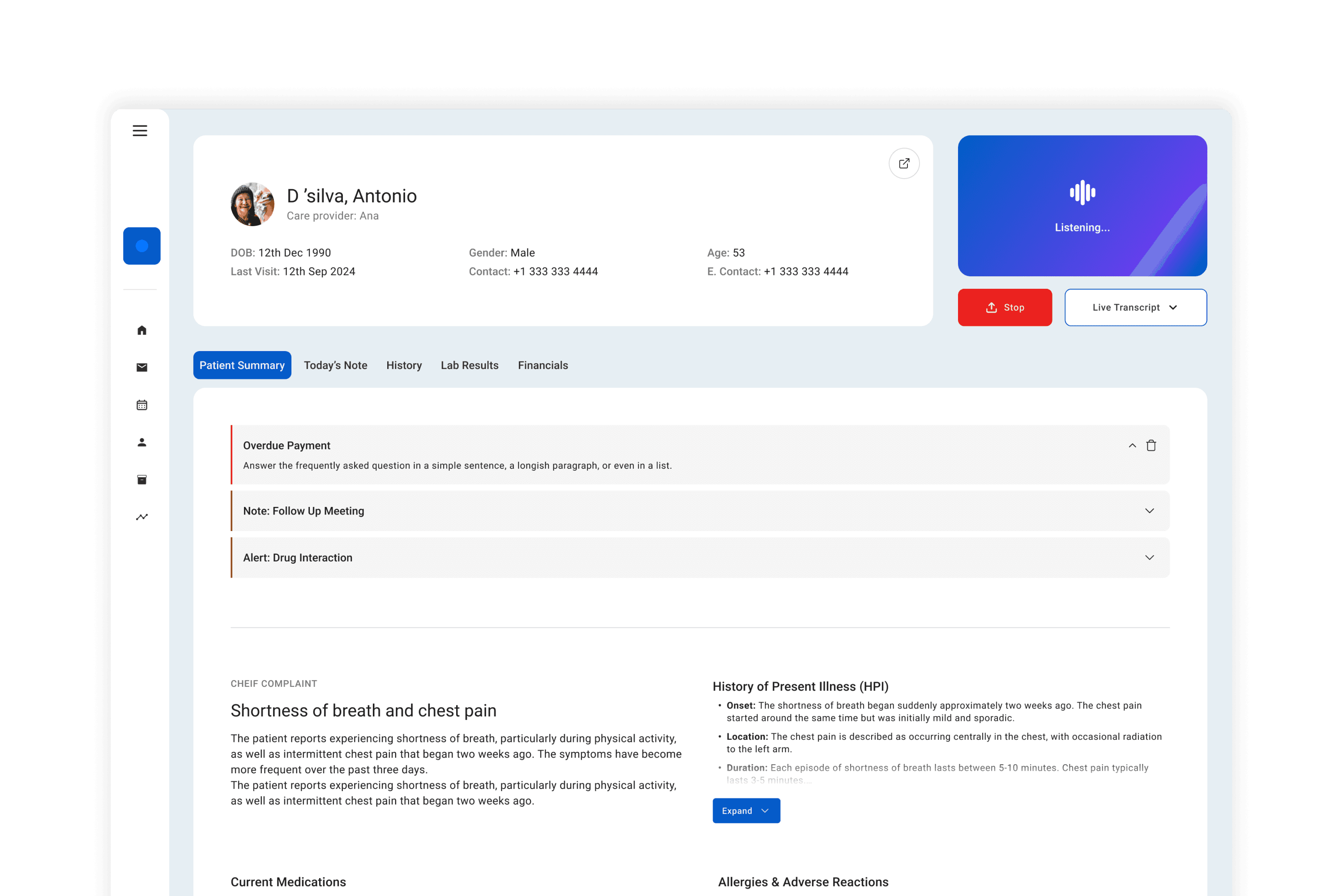
I recognized that having the screen space always reserved for transcript - isn’t really ideal. - So I reverted to the original CTA - with a progressive disclosure mechanism. This freed up the space on the screen to display more content from patient summary, which is what the PCP uses while walking to the patient's room. Essentially, the transcript is only shown during its context of use.
Here, after the user clicks on the "Start Listening" CTA, the CTAs right below it would change to "Stop" and "Show Transcript - On clicking show transcript, the section expands, and shows live transcript.


Hi-Fi
High-Fidelity Screens: The New Syntra?
These screens are made taking into consideration regulations, and references from a few health-care related design systems.
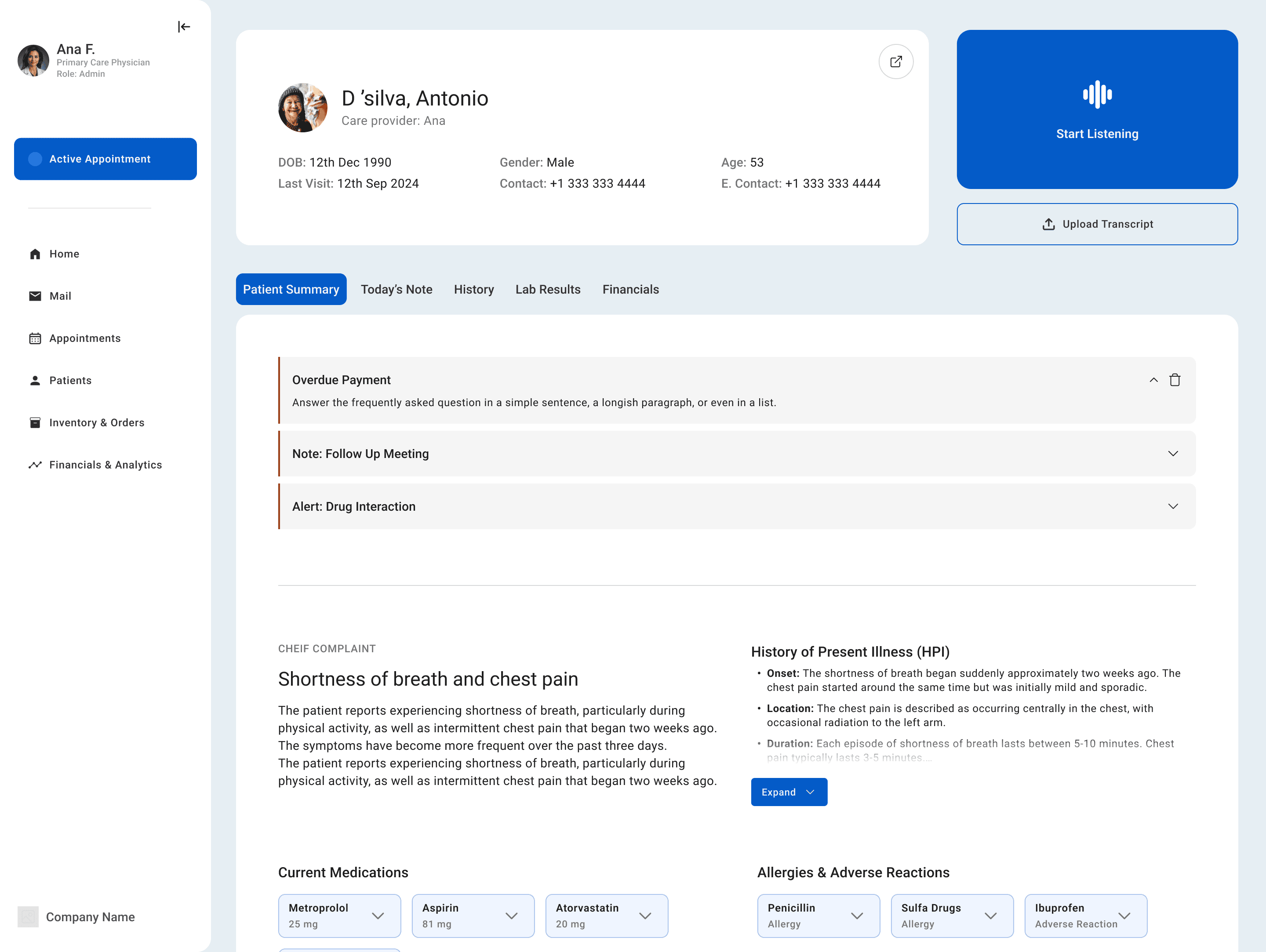
Screen 1: EHR Patient View
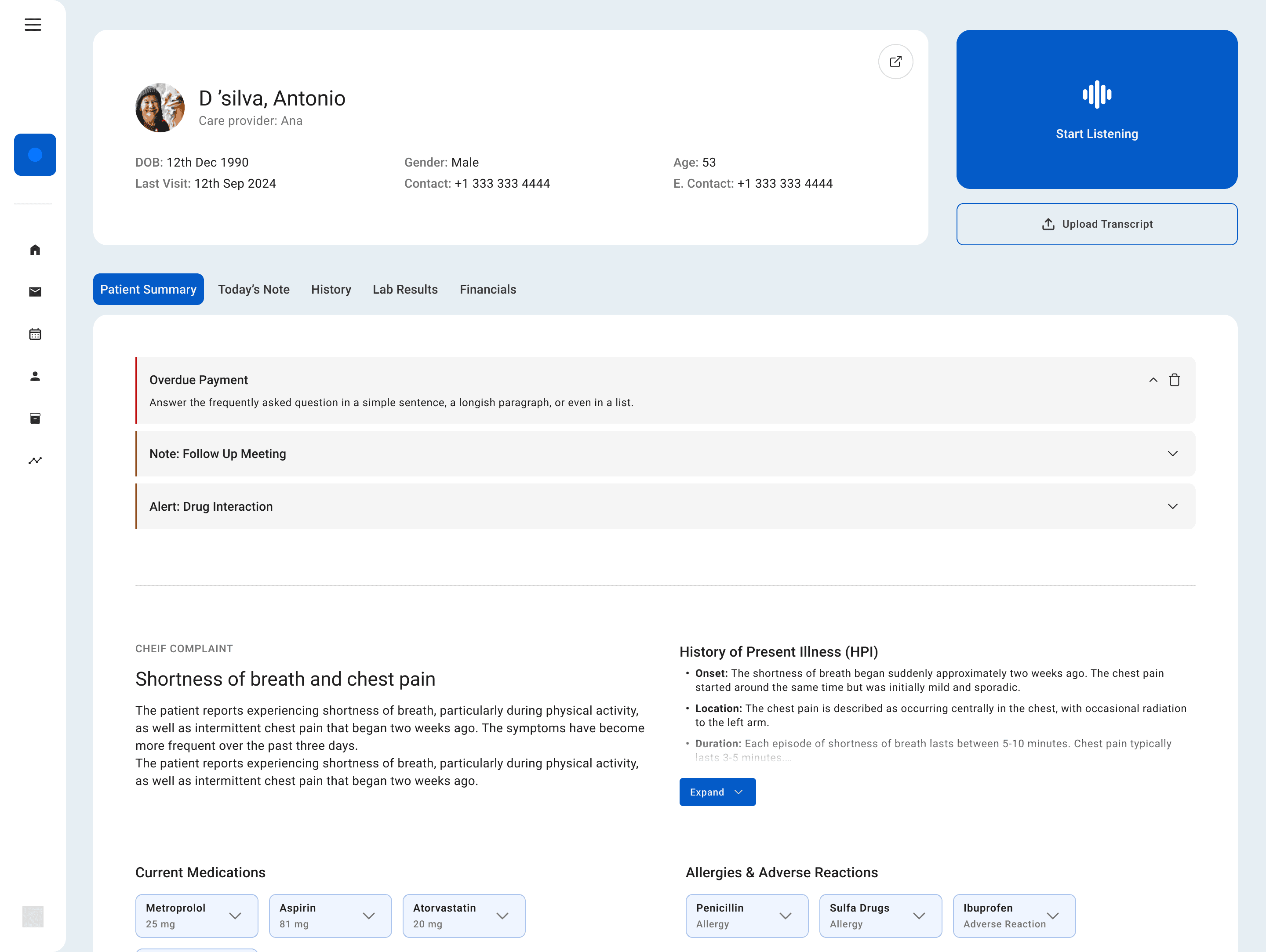
Screen 2: EHR Patient View Navbar Collapse
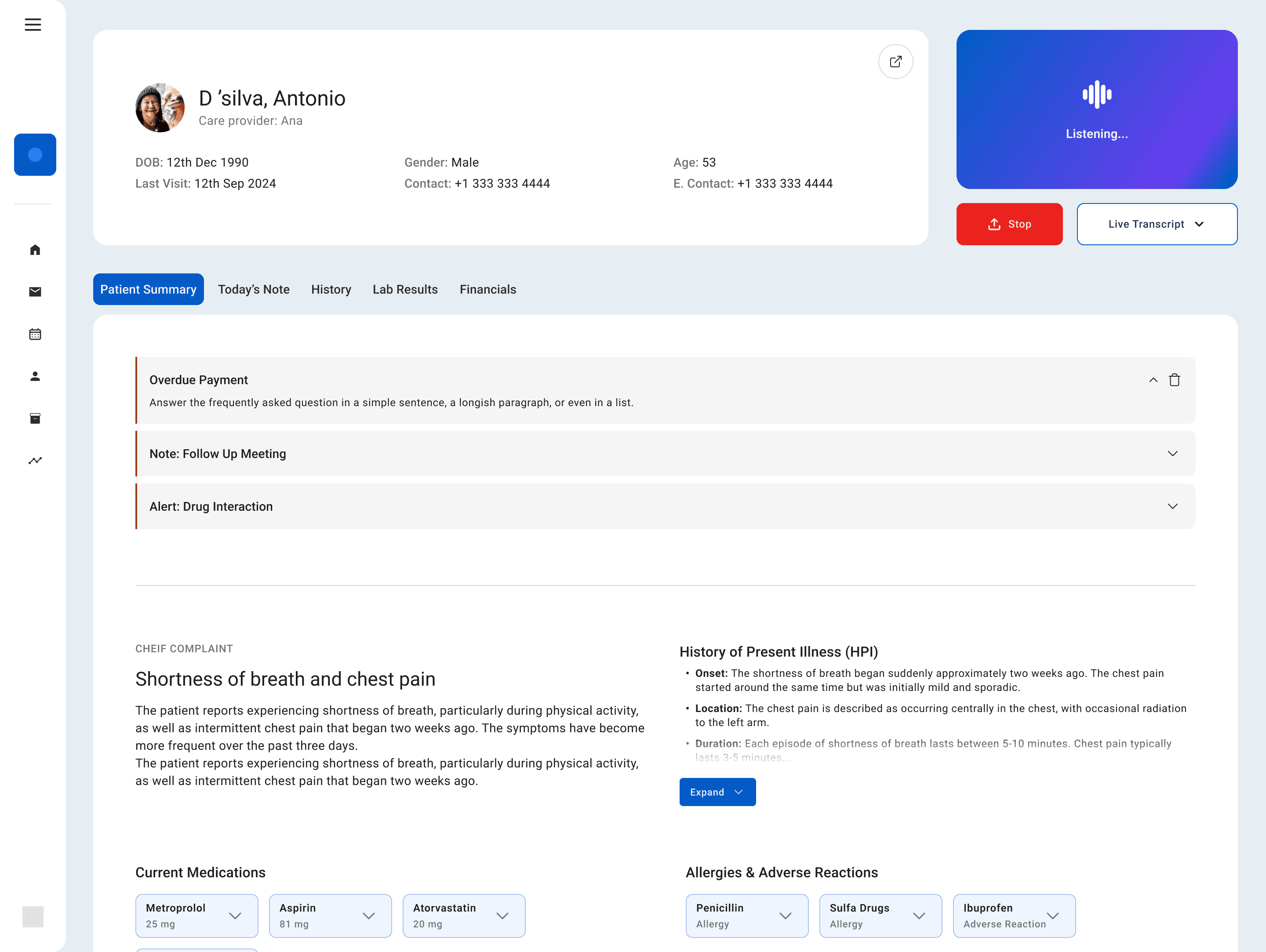
Screen 3: Active Listening
Screen 4: Active Listening - Transcript

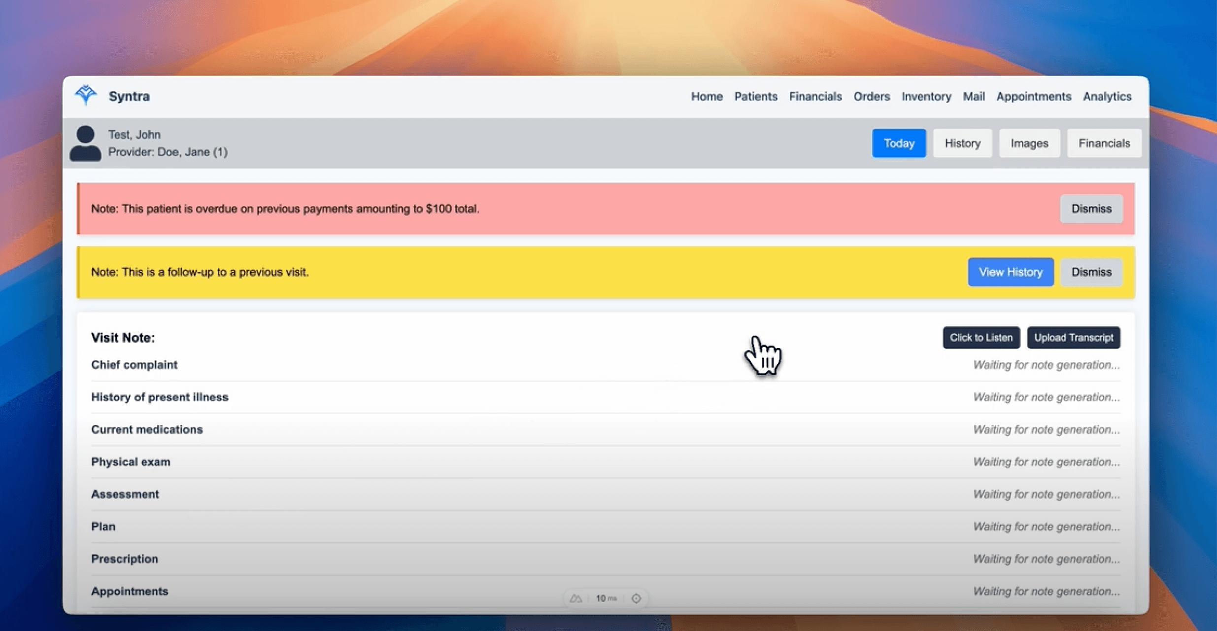
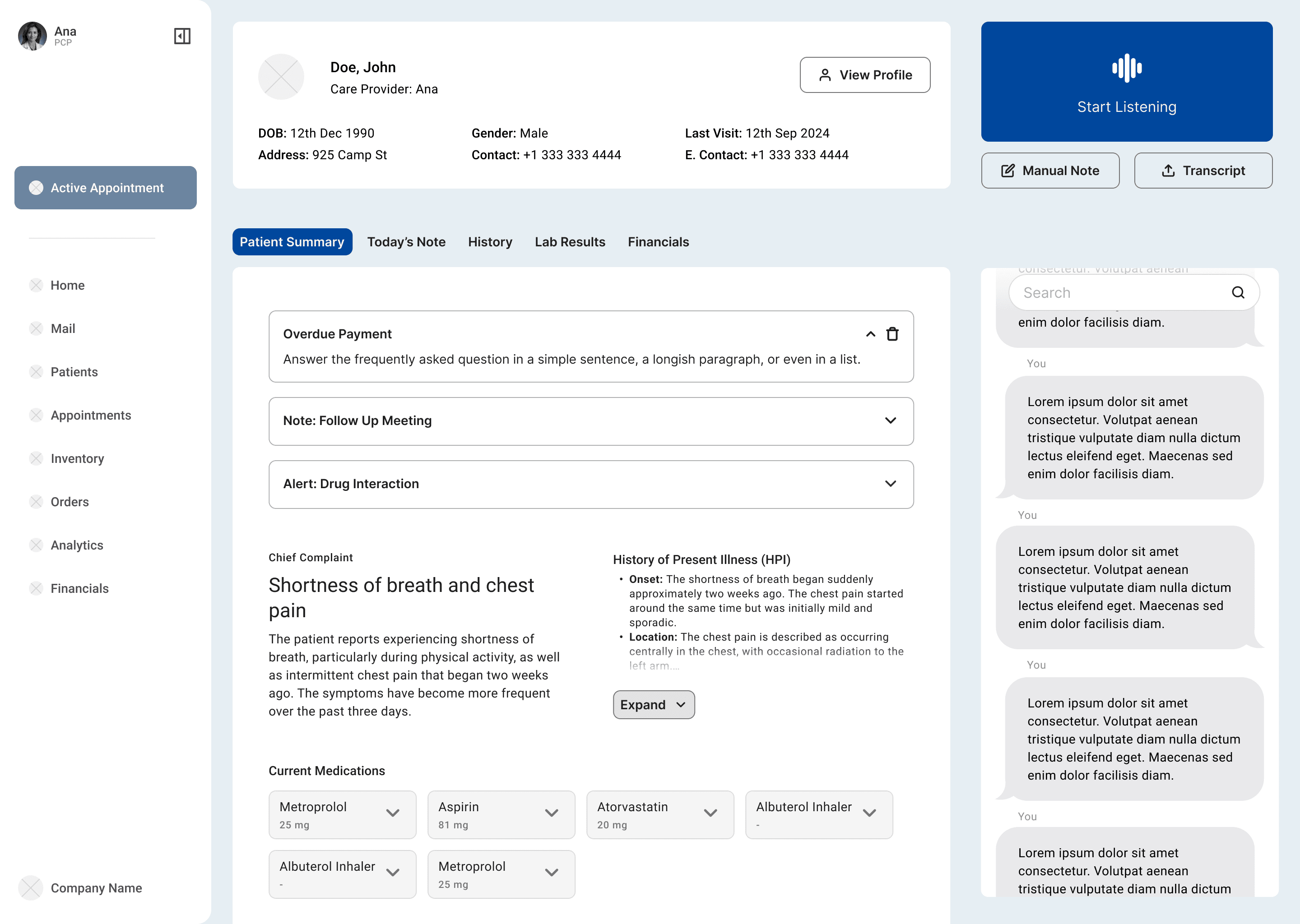
Syntra's Original Screen for Comparison (Dated 10/01/2024)