
Context
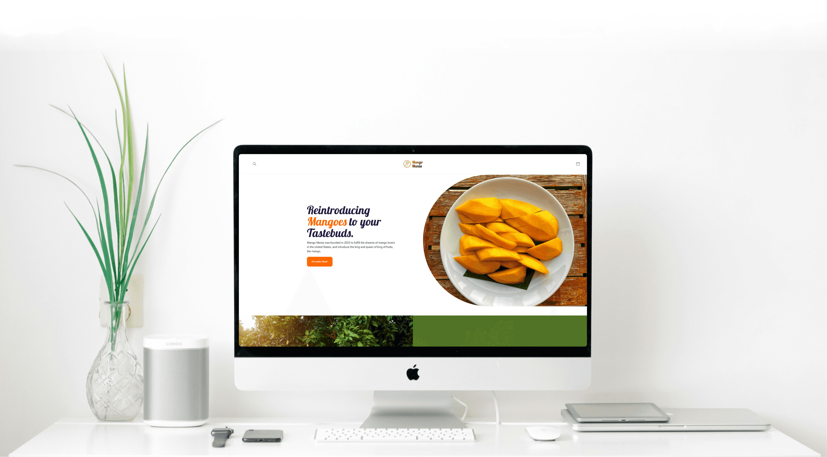
Mango Mania Shopify Store Redesign Project
Mango Mania is an e-commerce venture that brings Alphonso Mangoes (Indian-origin) in the United States.
Abhishek, the CEO of Mango Mania connected with me through LinkedIn and sought my expertise for a website usability assessment. The initial usability assessment ended up turning into a re-design project. I also ended up implementing the website on Shopify platform, and monitored the analytics to iterate on the initial implementation.
Overview
Goal
The goal was to conduct a usability assessment, and re-design the website to provide a better user experience.
Outcome
I re-designed the website using Figma, and implemented it using Shopify. I also achieved a 48% increase in conversion rate, after iterating on the website, post-release.
Info
Role
UX Designer
Duration
1 Week
Tools Used
Figma, Shopify, Photoshop
Team
None - Solo Project
Setting Expectations
Some things to keep in mind before we begin
Metrics are based on a week's data
A week after the release, when the no. of new visitors per day reached a plateau, I saw that the conversion rate was below the average, this is when I conducted a cognitive walkthrough to figure any usability issues, fixed them, and measured the data after a week again.
Time constraint of a week - A short project
As mango is a seasonal fruit, time is of the essence when it comes to selling it. When I was given the project, I had a tight deadline of a week as Mango Mania's shipments would arrive by then.
Design Process
From Initial Research to Implementation in One Week
Day 1
Research & Understanding the Audience
I conducted preliminary meetings with Mango Mania leadership, and researched Shopify blog to understand e-commerce best practices. The outcome was a best-practices checklist and two user groups.
Day 2
Website Usability Audit
Utilizing the two user groups, I quickly created two user flows for the current website. I utilized these flows, NNg's heuristics, and the usability checklist I had to evaluate the website.
Days 3 - 4
Figma Re-design
I utilized Figma to create multiple screens that would essentially fix the usability issues. The website also needed a little bit of a re-branding, so I created a visual design mood-board to inform my re-design.
Days 5 - 7
Shopify Implementation
As the MangoMania team didn't really have a developer at the time, I offered to develop a preliminary website using their existing Shopify account. This website would serve as a stepping stone to future iterations.
A Week after Release
Increasing the Conversion Rate to Above Average
As I didn't have time to test with real-users, I waited a week to see the website analytics. On recognizing the below average conversion rate, I analyzed the data and conducted a cognitive walkthrough to understand where the issue was. I fixed it, resulting in a 48% increase in conversion rate.
Initial Research
Identifying users & Shopify Best Practices.
Conducting two meetings with the founders and using the Shopify blog, I was able to articulate some general practices in the form of a checklist, and create two user groups.
Simplified Shopify Best Practices Checklist
Loading Time
Timing the website’s responsiveness on various devices.
Precise Navigation
Testing button-led journeys for user's mental model accuracy.
Mobile Friendliness
Ensuring layouts are maintained responsively on smartphones.
Copywriting Clarity
Ensuring the prose is as clear.
Attention Capture
Measuring the site’s aesthetic.

User Group A: New Users
These users access the website via social media. They already have a motive as they got hooked to something through advertisement. I needed to ensure that this "hook" is present in the landing page.

User Group B: Existing Users
These users already know and trust the brand, all they want to do is buy multiple products and reach checkout without any hiccups.
UX Audit
Creating User Flows and Finding Usability Issues
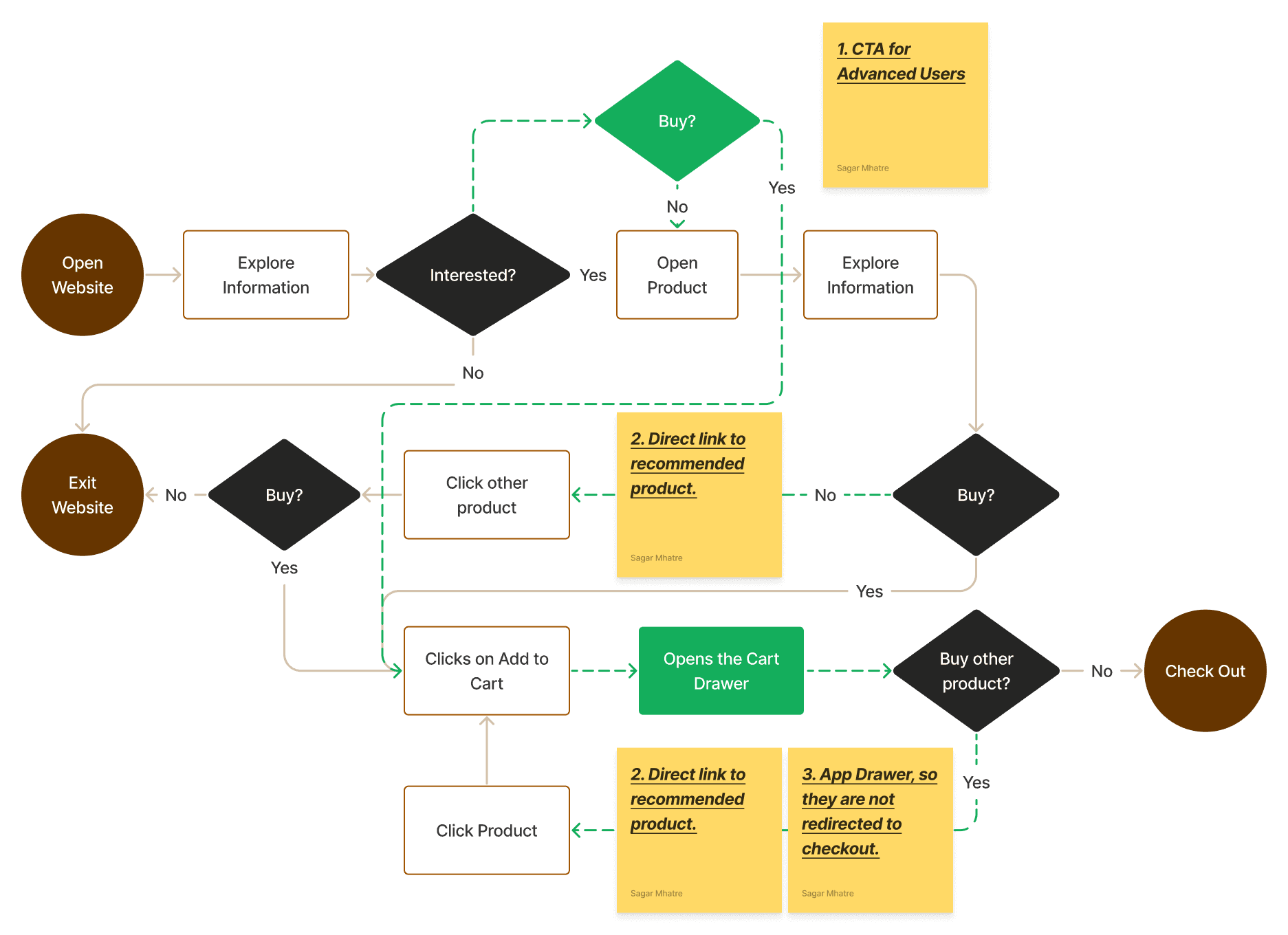
Following the identification of user groups, I created the following golden user flow. I utilized this to trace the path a customer would take to reach the final checkout.

Following were some of the major usability issues that I found with the website:

Failing foreground to background contrast ratio, adversely affecting readability
The CTA button blended into the background, making it easy to miss, while the low-opacity text beneath it further reduced visibility. Additionally, the complex image behind the text makes key information hard to read.

Information overload and no heading
The about section is crammed and has no title. This reduced scanability and could cause users to miss important value propositions.
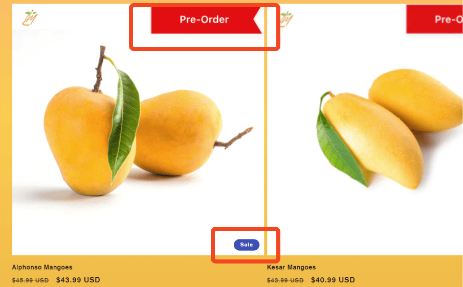
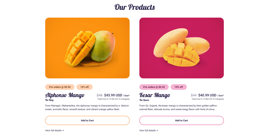
Redundant pre-order tags & tiny sale tags that can be missed easily
The pre-order tag was a part of the image and not a coded element. This may cause the users to believe that the product is still on pre-order and may drive away some customers. Also, the sale tag is less visible compared to the bolder pre-order tag, and could be missed, potentially affecting the sales.
Returning users couldn't directly add items to cart and skip to checkout from home page
The current user flow of the website was not optimized for returning users. This was due to the users being unable to add items to cart directly from the home page. They had open a product, add that product, go back to home page, and add another product.
Outside these issues, the overall website also had too much of textual content that was arguably redundant. When I presented this to the stakeholders, they asked if I could do an entire re-design of the Website - to which I said yes.
Branding
Starting by creating a Brand Identity
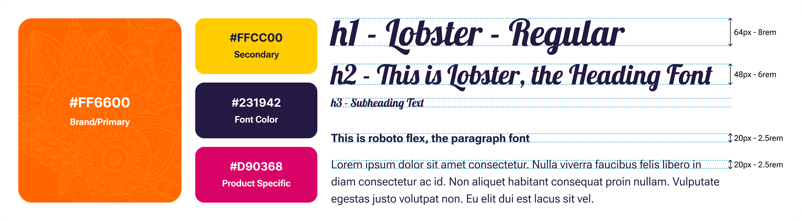
To create a brand identity for the Mango-Mania website, I conducted market competitor research, to see their brands, what stood out to me was that none of the competitors had an actual branding going on. Almost everyone had black-white old-school e-commerce layouts. I started by creating a mood-board and created the brand identity from there.
The identity encompassed two core values derived from Mango Mania's products:
Authenticity from India
I emphasized the organic cultivation of the product in Indian farms and the Indian culture through vibrant colors, and Mandela graphics.
Exoticity of Indian Mangoes
Highlighting the uniqueness of the product, particularly as mangoes are regarded as exotic fruits in tropical regions through the lobster font.
Fixing Usability Issues
Optimizing the User Flow
As revealed through the audit, there was no way for advanced users to quickly progress through the website to add multiple products. I created a new user flow for this, so that the product page the other product under recommended products as well as created a direct add to cart CTA on the homepage.
This streamlined the process by removing the need for users to go to the product page to add that product to their cart.

Fixing the Usability Issues
I started by fixing the key usability issues mentioned in the above section. The following section highlights how I achieved it:

Increased contrast ratio, increasing readability
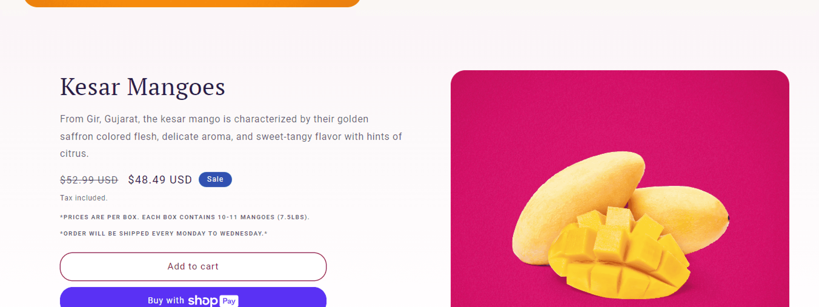
Using the aforementioned brand identity, I ensured that the fore-ground to background ratio passes the AAA standards for Accessibility. The image used is also completely visible to reduce cognitive load from the previously, complex image.

Added a heading and reduced content
The previously crammed about section now features a heading to give the users an idea about what to expect about the product as well as the text below. Even if the section isn't read, the heading delivers enough value to instill trust to our audience.
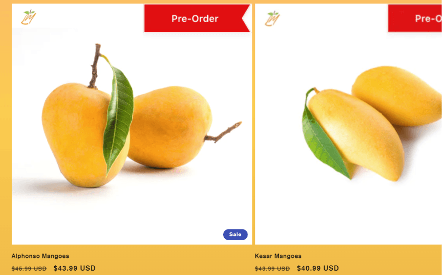
Visible Tags
The new design makes the tags more visible by driving user attention through color and placement outside of the image.
Shopify Implementation
Creating a Shopify shop in two days.
This was my first time using the Shopify platform, however, this is where my engineering degree came into play. Within half a day - I explored and learned all the tools I needed to implement the website.
To create the store, I used a little bit of code (CSS), Shopify's existing themes, and made font changes as Shopify's theme was not rendering the font lobster correctly across the website.
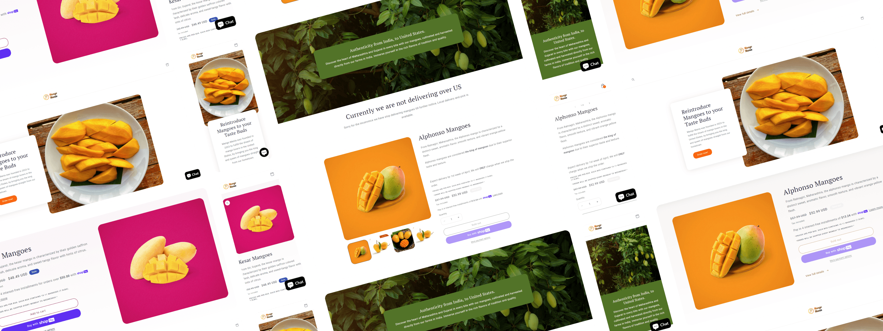
Somehow, I found a balance between my designs, it's implementation, and the time-constraint of two days. This is the outcome:
Initial Numbers
Why & how I conducted a Usability Test
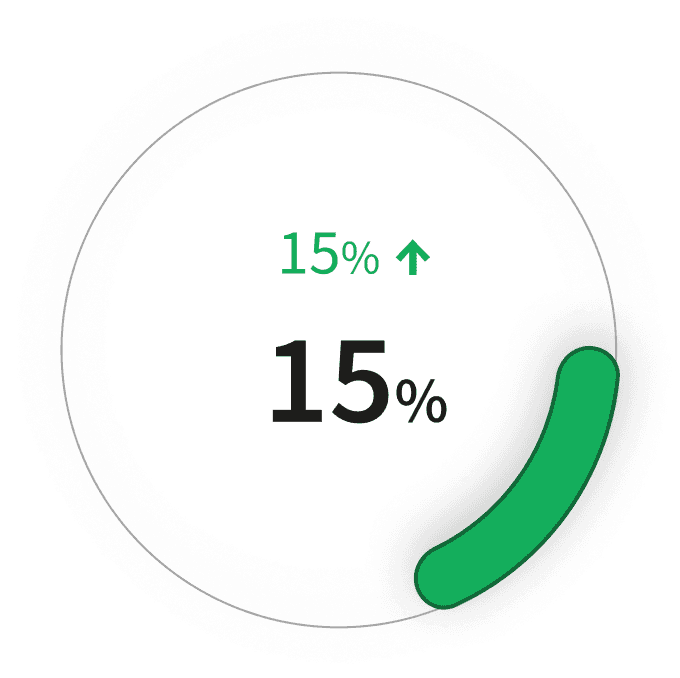
For Shopify stores, according to their analytics, the average reached checkout rate lies between 29% and 54%. The average reached checkout rate for our store was 44% which was low compared to the upper limit. This made re-check the website for any usability issues.
I conducted usability testing using a cognitive walkthrough within an hour to find the issue and fixed it.

Rate for 'Added to Cart'

Rate for 'Reached Checkout'
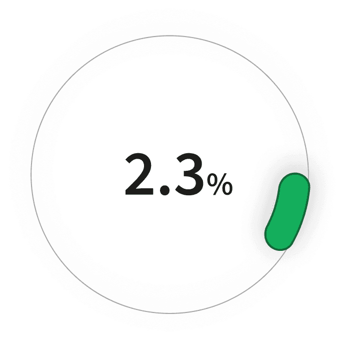
Conversion Rate
Problem: Cart CTA that hides on scroll down, also hiding the checkout button
Whenever the user would scroll down, the cart would hide itself, hiding the 'checkout' CTA.
Fix: Made the header sticky and made it so that clicking 'add to cart' opens the cart drawer

This makes it so that the cart CTA is always visible and if the users don't know where to find it, adding an item to cart will open the cart drawer, revealing the checkout section.
After this change, I waited for a week to see the results. These were the new metrics:
Rate for 'Added to Cart'
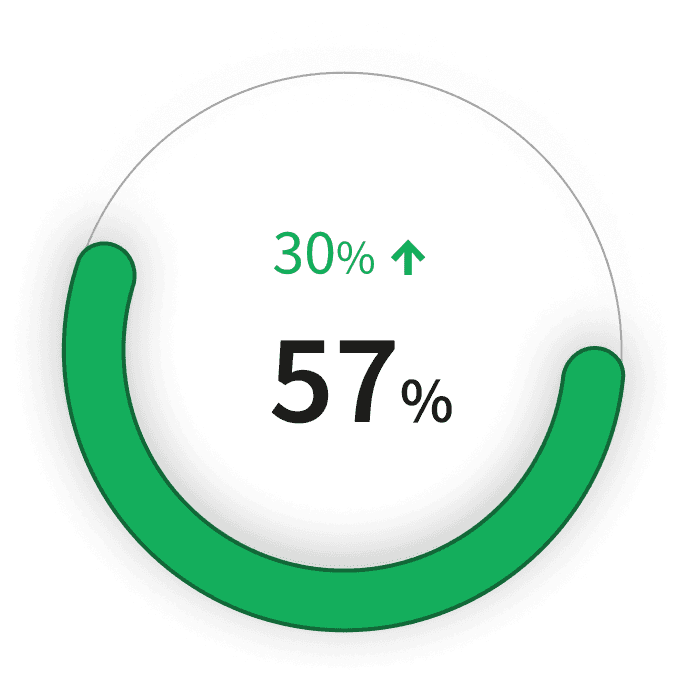
Rate for 'Reached Checkout'

Conversion Rate
Future Scope
Increase user engagement for new users
Implementing interactive features such as a short quiz to suggest suitable mango varieties based on user preferences. This personalized approach can help users who may be unfamiliar with mango varieties.
Checkout that uses progressive disclosure
The current checkout being too long, it may result in customer drop-off during checkout. Splitting the personal information and payment section can help streamline the checkout process to avoid these scenarios.
Provide a chart with product specifications
Introduce a comprehensive chart detailing product specifications, including taste profiles, nutrient information, benefits, and ripeness indicators. This resource will empower users with the knowledge needed to make informed decisions, considering the diverse preferences and expectations of consumers.
Instructions for storage
Enhancing the user experience beyond the website by providing guidance on proper mango storage conditions. This could include attaching a pamphlet or sticker to delivery boxes, outlining optimal storage methods to ensure mangoes ripen properly and maintain their flavor.