I re-designed the website using Figma, and implemented it using Shopify

1.0 Introduction
Mango Mania is an e-commerce venture that brings Alphonso Mangoes (Indian-origin) in the United States.
Abhishek, the CEO of Mango Mania sought my expertise for a website usability assessment. The initial usability assessment ended up turning into a re-design project. I also implemented the website on Shopify platform, and monitored the analytics to iterate on the initial implementation.
Role
UX Designer
Duration
Apr 2024
~1 Week
Tools Used


1.1 Project's Goal
The goal was to conduct a usability assessment, and re-design the website to provide a modern user experience.
The re-design was proposed by me to ensure that the website meets modern standards as the target audience shifts.
1.2 Outcome
I re-designed the website using Figma, and implemented it using Shopify. I also achieved a 48% increase in conversion rate, after iterating on the website, post-release.
2.0 From Initial Research to Implementation in One Week
Day 1
Research & Understanding the Audience
I conducted preliminary meetings with Mango Mania leadership, and researched Shopify blog to understand e-commerce best practices. The outcome was a best-practices checklist and two user groups.
Day 2
Website Usability Audit
Utilizing the two user groups, I quickly created two user flows for the current website. I utilized these flows, NNg's heuristics, and the usability checklist I had to evaluate the website.
Days 3–4
Figma Re-design
I utilized Figma to create multiple screens that would essentially fix the usability issues. The website also needed a little bit of a re-branding, so I created a visual design mood-board to inform my re-design.
Days 5–7
Design Ideation Workshop
As the MangoMania team didn't really have a developer at the time, I offered to develop a preliminary website using their existing Shopify account. This website would serve as a stepping stone to future iterations.
A Week after Release
Increasing the Conversion Rate to Above Average
I waited a week to see the website analytics. On recognizing the below average conversion rate, I analyzed the data and conducted a cognitive walkthrough to understand where the issue was. I fixed it, resulting in a 48% increase in conversion rate.
3.0 Identifying users & Shopify Best Practices
Conducting two meetings with the founders and using the Shopify blog, I was able to articulate some general practices in the form of a checklist, and create two user groups. The following is a simplified checklist:
Loading Time
Timing the website’s responsiveness on various devices.
Precise Navigation
Testing button-led journeys for user's mental model accuracy.
Mobile Friendliness
Ensuring layouts are maintained responsively on smartphones.
Copywriting Clarity
Ensuring the prose is as clear.
Attention Capture
Measuring the site’s aesthetic.
The following are the two types of users:

New Users
These users access the website via social media. They already have a motive as they got hooked to something through advertisement. I needed to ensure that this "hook" is present in the landing page.

Existing/Advanced Users
These users already know and trust the brand, all they want to do is buy multiple products and reach checkout without any hiccups.
4.2 The Roadmap in Notion: For Project Tracking
I developed a comprehensive project roadmap using FigJam and Notion, enabling the team to visualize progress and maintain a structured plan. These tools provided clear goals for each phase, ensuring effective tracking and direction throughout the project.
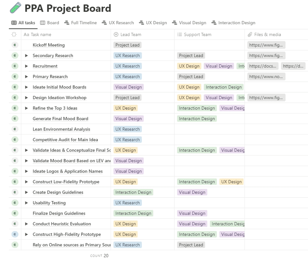
Image: Notion roadmap
4.3 Establishing Success Metrics
To measure success, I established key performance indicators (KPIs):
User Satisfaction Score
Evaluated through qualitative feedback during usability tests.
Task-Success Rate
Evaluated through goals (tasks) accomplished without an error during usability tests.
ADA Compliance
Measured by an accessibility checklist, based on WCAG 2.1
5.0 Key Problems of the Target Users
The UX research team and I conducted secondary research to define the problem space and developed an interview protocol. We subsequently interviewed 10 participants with Parkinson's Disease (PD).
The following were the key problems:
Treatment updates only available in-person
Changes and updates in treatment are typically only available in person, as movement disorder specialists (MDS) cannot fully rely on symptoms manually logged by patients.
Misses appointments due to limited mobility
Limited mobility, combined with a lack of comprehensive familial care, often resulted in missed appointments.
Doesn't know how to manage mental health
Parkinson's Disease often presents with non-motor symptoms, such as depression. While these symptoms can be mitigated through non-medical interventions, patients are often unaware of what could help them.
Forgets to take medication occasionally or tends to overdose
Forgetting to take medication or occasionally overdosing was the most common issue reported by interviewees.
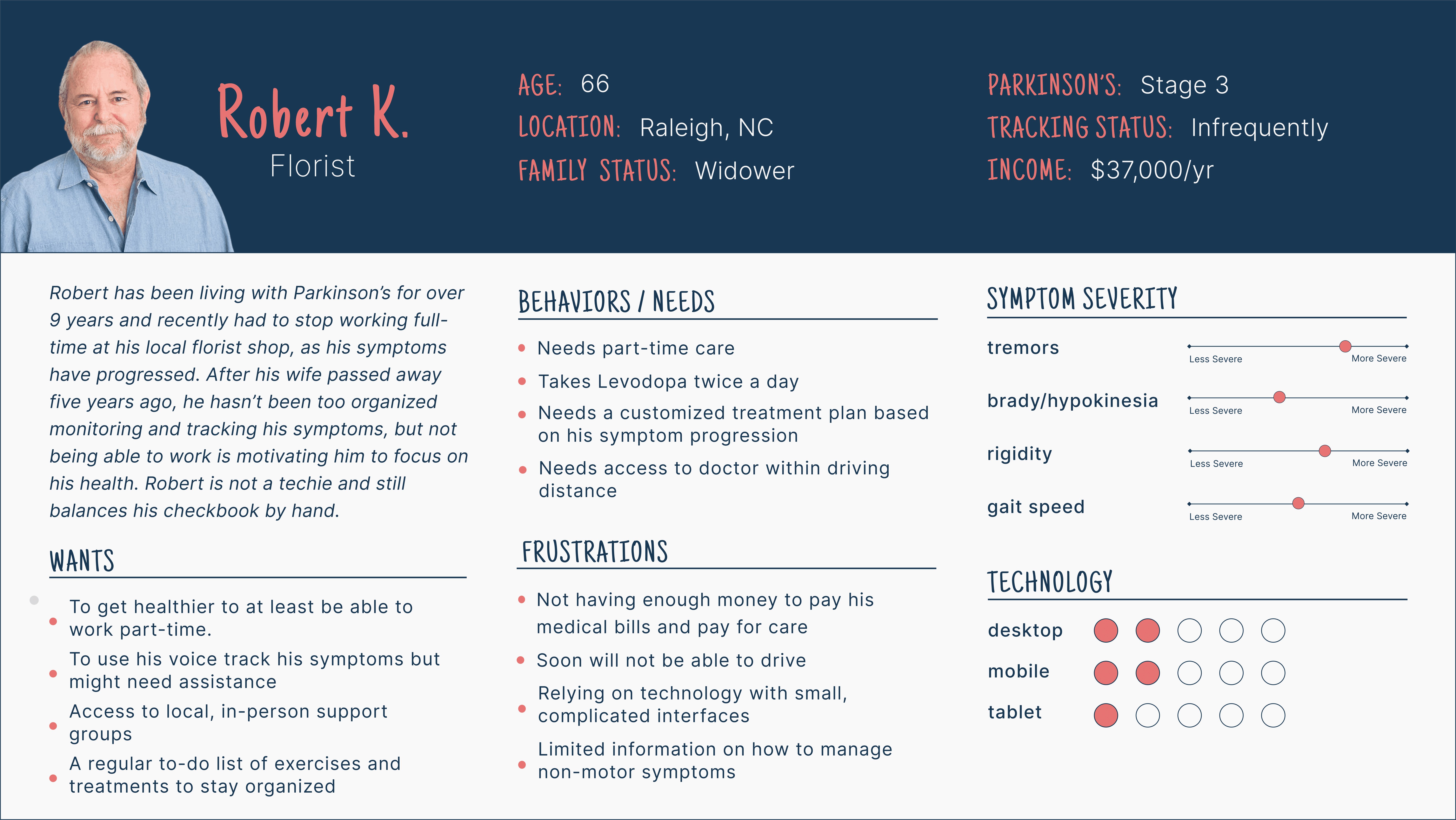
5.1 User Personas
Based on these findings, I led the creation of user personas. Initially, I proposed developing proto-personas to highlight facts derived from secondary research. These were later refined into full user personas as we gathered behavioral data through interviews

6.0 Ideation: Design Workshop
With the core problems defined, I led a design workshop to kickstart the ideation process. I presented the challenges and guided the team through various methods to identify feasible solutions.
The key steps in the design workshop included:
6.1
Research Presentation
The research team and I synthesized the core problems as outlined earlier. Alongside the UX Research Lead, I presented these problems, as well as other significant synthesized issues, to the design team.
This presentation helped address any questions or doubts the design team had, ensuring a clear understanding of the challenges.
6.2
Problem Critique & Selection
Each designer on the team critiqued the key problems, contributing their concluding thoughts for each one.
We then held an anonymous vote to determine which problems we wanted to address. From this process, we selected the top three problems to focus on. These were as follows:
6.3
Brainwriting & Affinity Mapping
Brainwriting enabled each individual to contribute unique ideas freely, resulting in the generation of over 15 creative concepts.
Following the brainwriting session, I recommended conducting affinity mapping to organize the ideas. This process allowed us to group high-level concepts together while incorporating some low-level ideas as additional features within the high-level concepts.

6.4
Landscape Mapping
A landscape map helps visualize ideas or concepts based on our perception of their feasibility and desirability.
Using this approach, we identified and segregated the most desirable and technically feasible ideas. The outcome of this process was the following top three ideas:
Virtual Patient-Doctor Meetups
Connecting patients and doctors virtually allowing remote consultations and treatment plans.
Symptom Logger
A tracking application that would allow the users to log their symptoms and share them with their doctor.
Recommended Resources
A resource library consisting of articles and videos that would give users recommended resources based on their condition.
6.5 Pursuing three ideas and addition of "Medication Reminders"
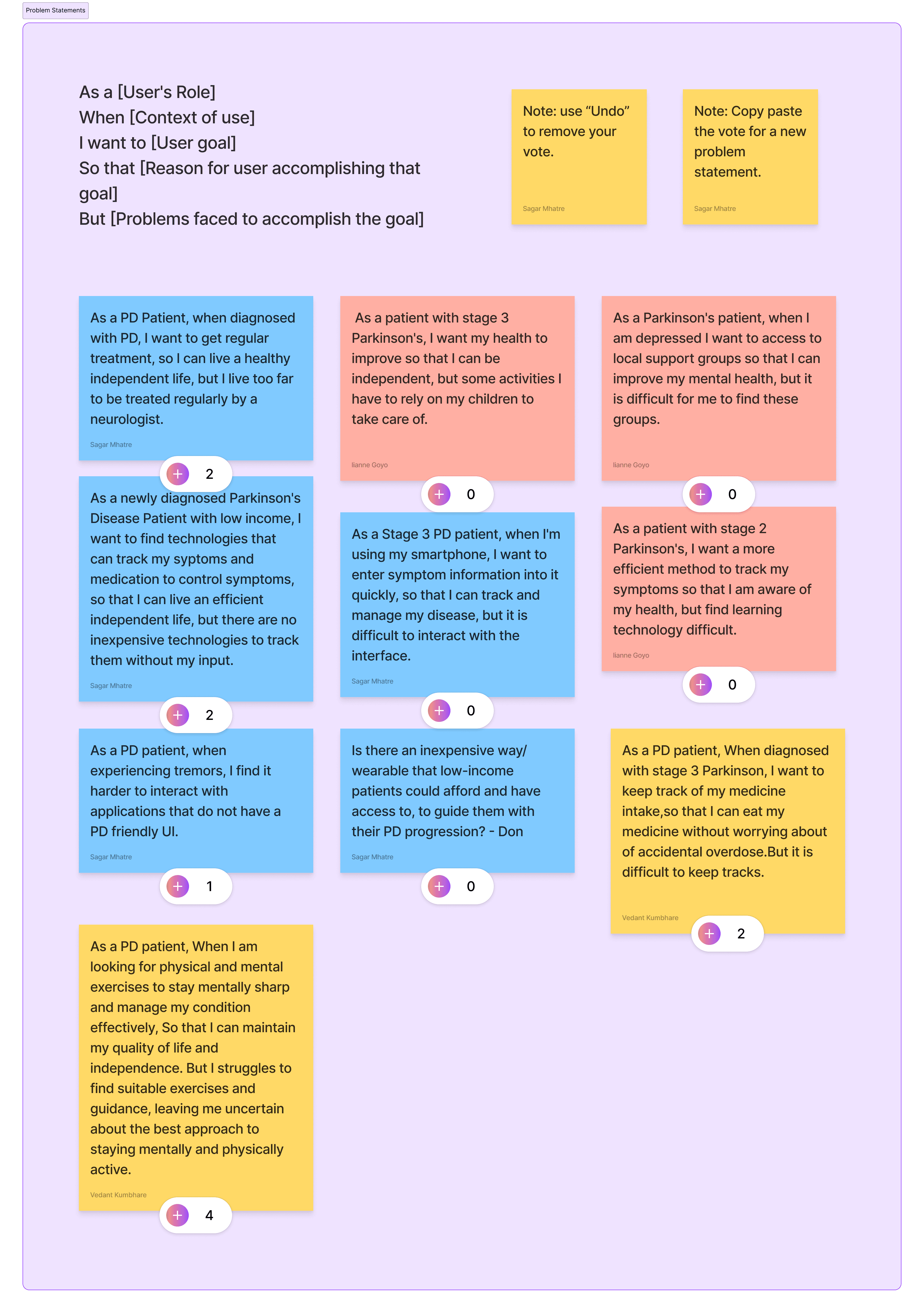
We decided to integrate all three ideas into a single application, as our initial research indicated that they were equally important. During discussions, we also identified an opportunity to incorporate automatic medication reminders linked to the treatment plan.
Image: Ideation Workshop
7.0 Creating the Information Architecture
To ensure efficiency, I divided the design team into three groups, each tasked with developing user flows for one of the three ideas. Once completed, I evaluated the flows and created a comprehensive information architecture that integrated all three ideas.
This approach improved efficiency by enabling the groups to independently work on their wireframes while maintaining clarity on how components linked to external pages or flows outside their respective groups.

Image: Information Architecture
8.0 Evaluating the Idea
The low-fidelity prototypes were created as three independent prototypes to test each user flow and gauge user sentiment for each idea.


8.1 Usability Testing Results
To simulate user behavior and tasks, we conducted internal usability testing using cognitive walkthroughs. Additionally, we gathered feedback from the initial 10 interview participants to understand user sentiment regarding the three ideas.
Information Overload in various Forms
Noted Issues
Solution
I divided the form into smaller, manageable sections to reduce cognitive load and enable users to validate their responses more quickly.
To address potential user drop-offs caused by the lengthened process, I added a step indicator at the top to provide visibility into system status. This design choice leveraged the goal-gradient effect, encouraging users to complete the process by showing their progress toward the goal.

Image: Old
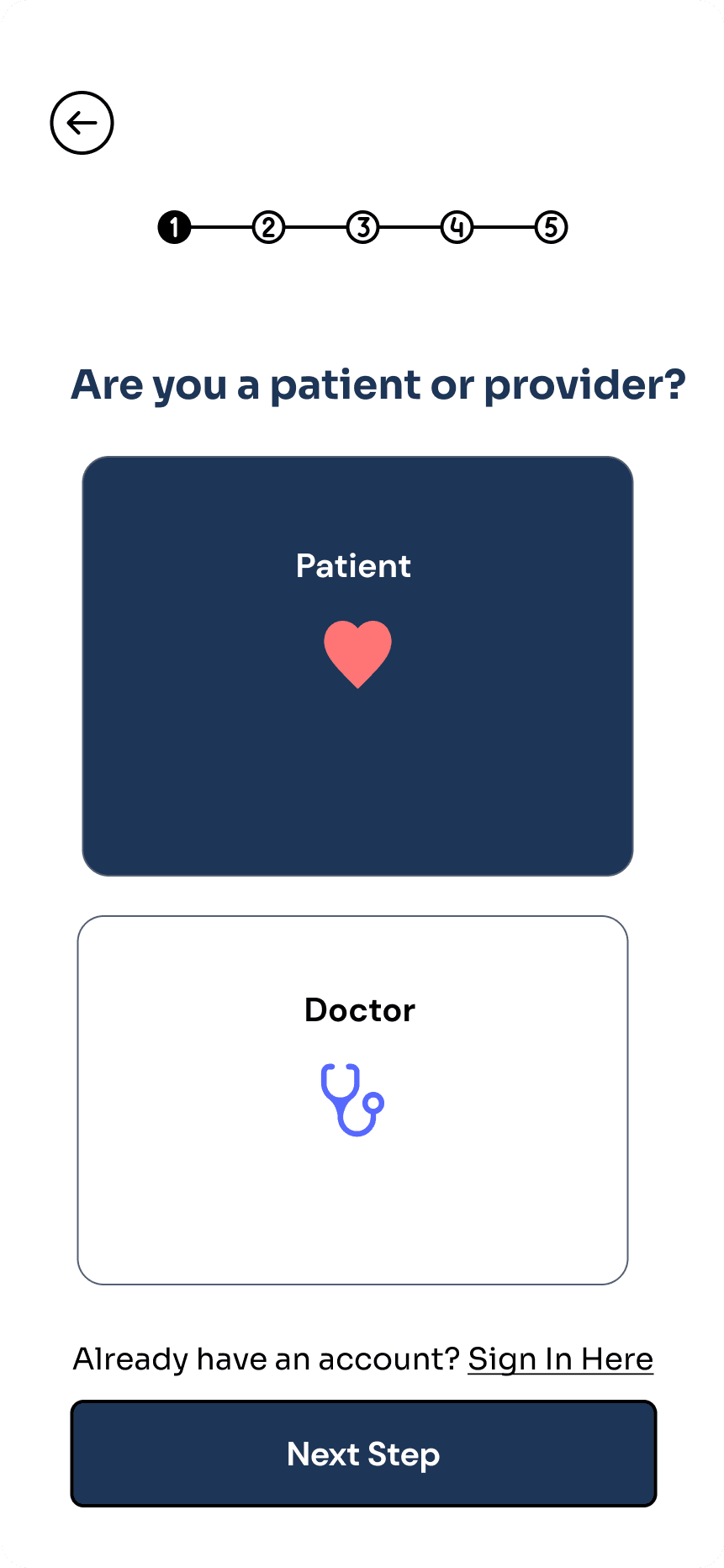
Image: New
Small Touch Areas (CTAs)
Noted Issues
Solution
To improve accessibility, I ensured that call-to-action (CTA) buttons had a minimum padding of 16px, creating a touch area of at least 32px by 32px, as recommended for individuals with motor disabilities.
Additionally, we increased the font size of CTA text by 2px to enhance readability.

Image: Old

Image: New
Users didn't know that recommended resources were tied to prescription
Noted Issues
Solution
I added a brief description indicating that the recommended section is linked to the user’s prescription.
Future scope
The feature allows doctors to attach specific resources directly to the prescription as recommendations.

Image: Old

Image: New
9.0 Brand Identity and Design System
I designed a mood board template to facilitate input from the research and design teams. This collaborative process directly shaped our brand identity.

Image: Moodboard
9.1 Design System
Prioritizing accessibility, I assisted in creating design components aligned with the finalized Visual Design Guidelines.

Image: Visual Design System
10.0 Outcome: PDConnect
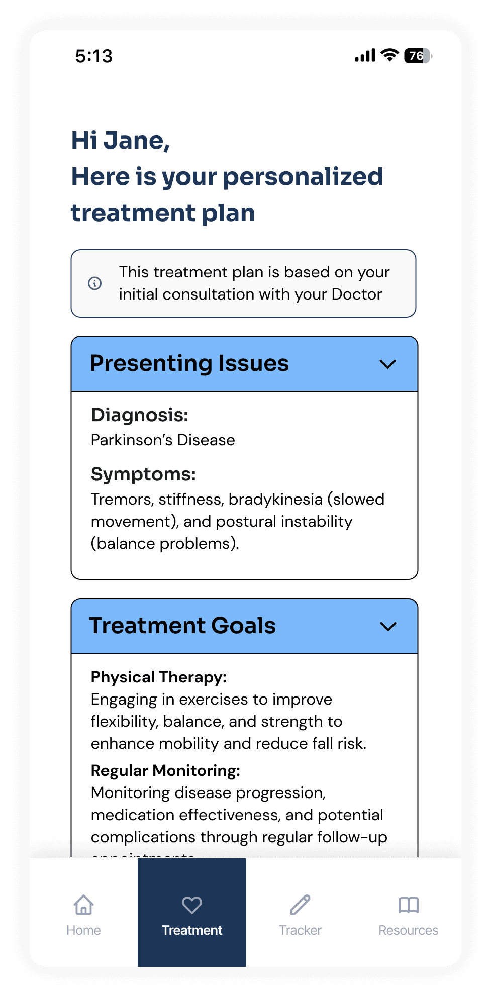
PDConnect is an app designed for Parkinson's Disease patients, offering remote consultations with MDS neurologists, symptom and medication tracking, and access to trusted treatment resources.
The app enables virtual consultations, sets medication reminders, and provides resources linked to the patient’s prescription to support their physical and mental well-being.
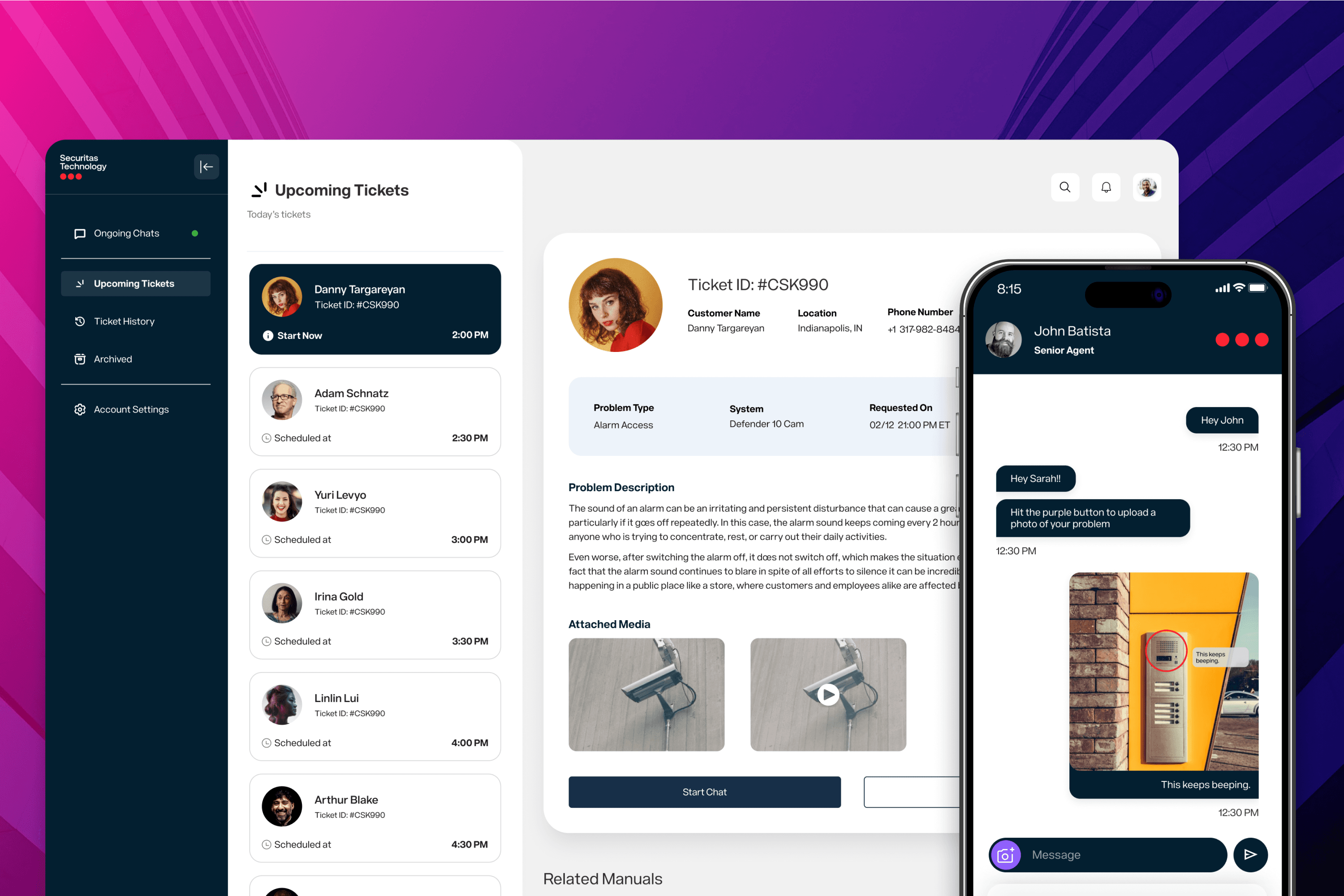
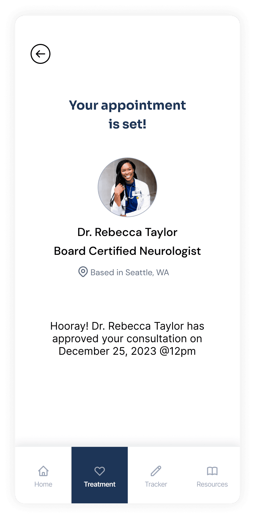
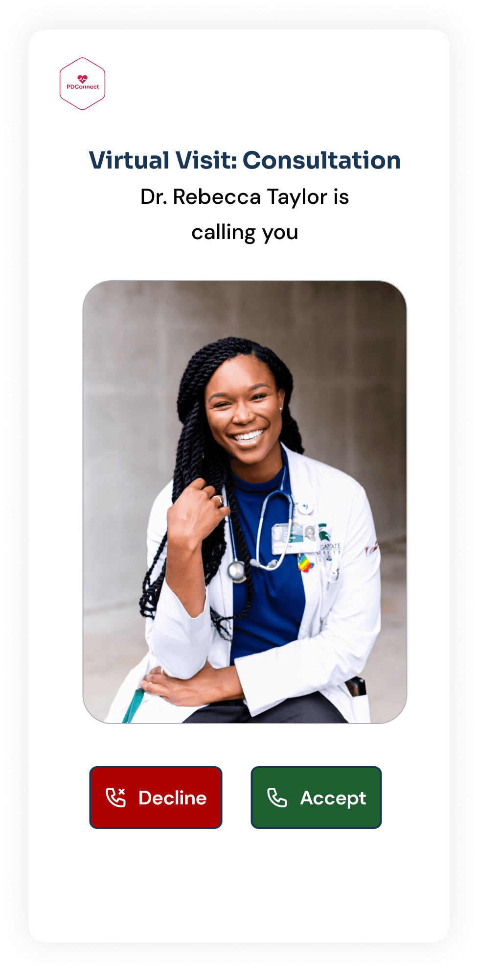
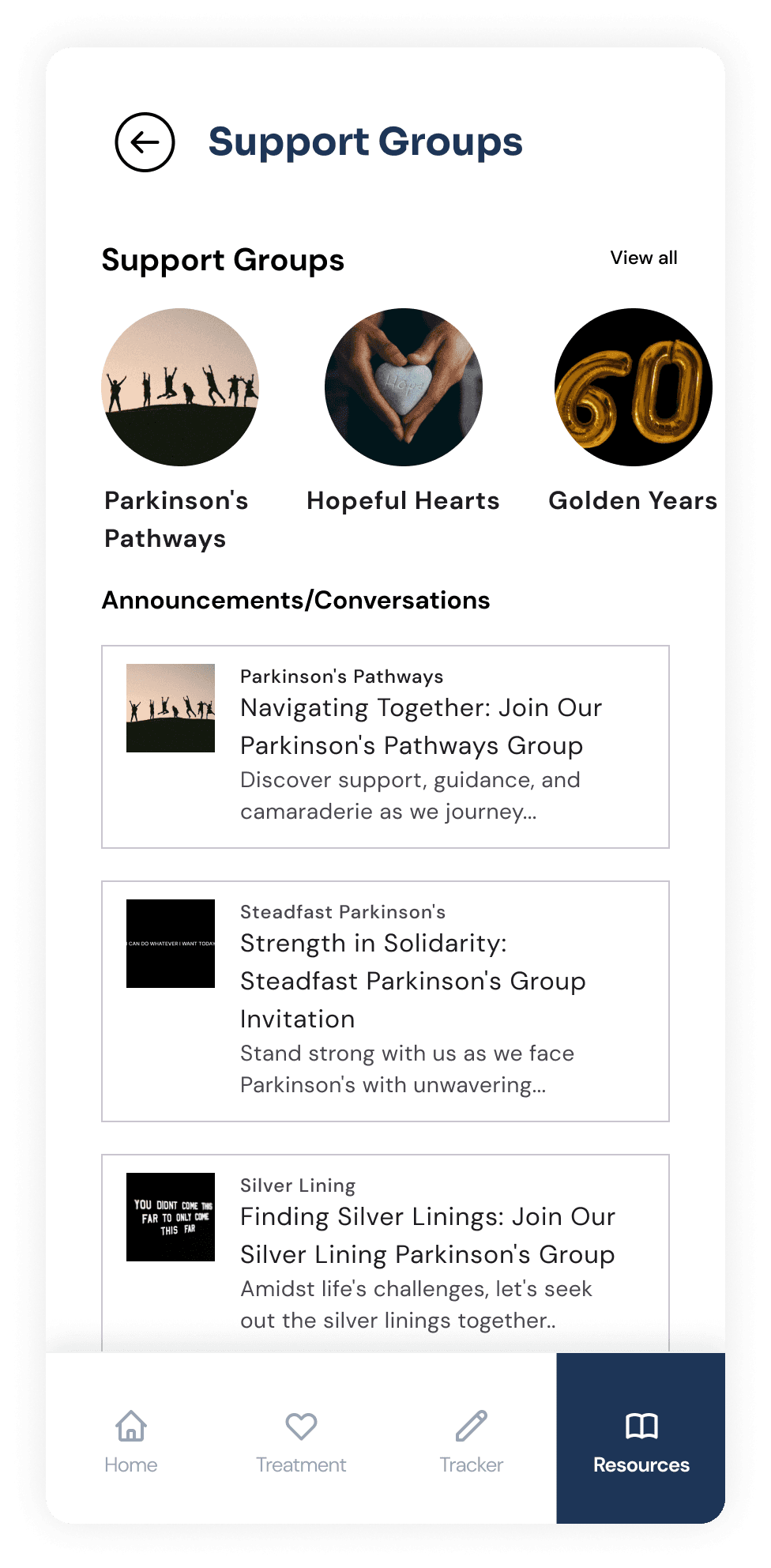
10.1 Remote patient-doctor connection
This feature enables patients to search for registered MDS neurologists, schedule virtual meetings, and receive initial consultations remotely.
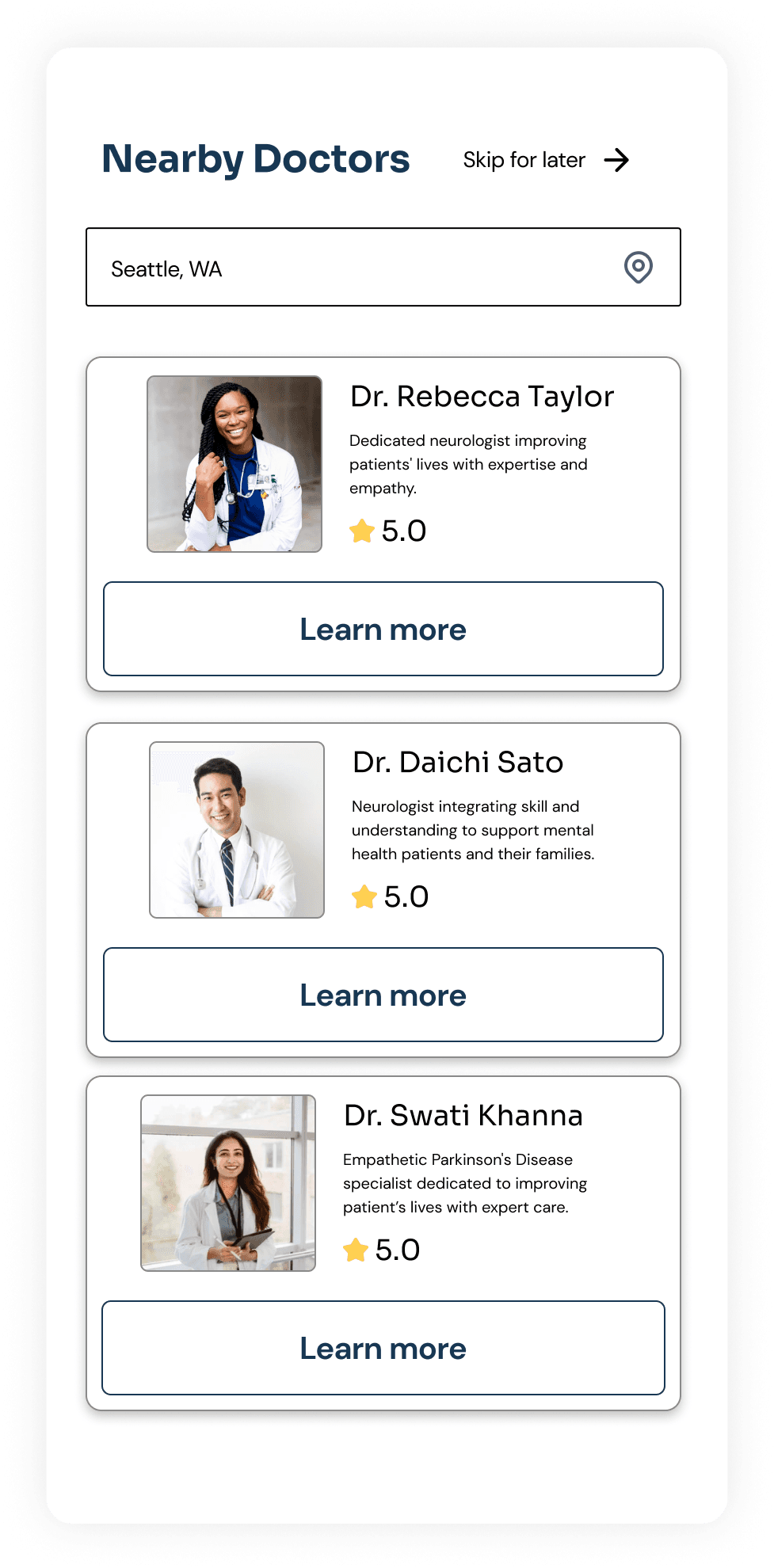
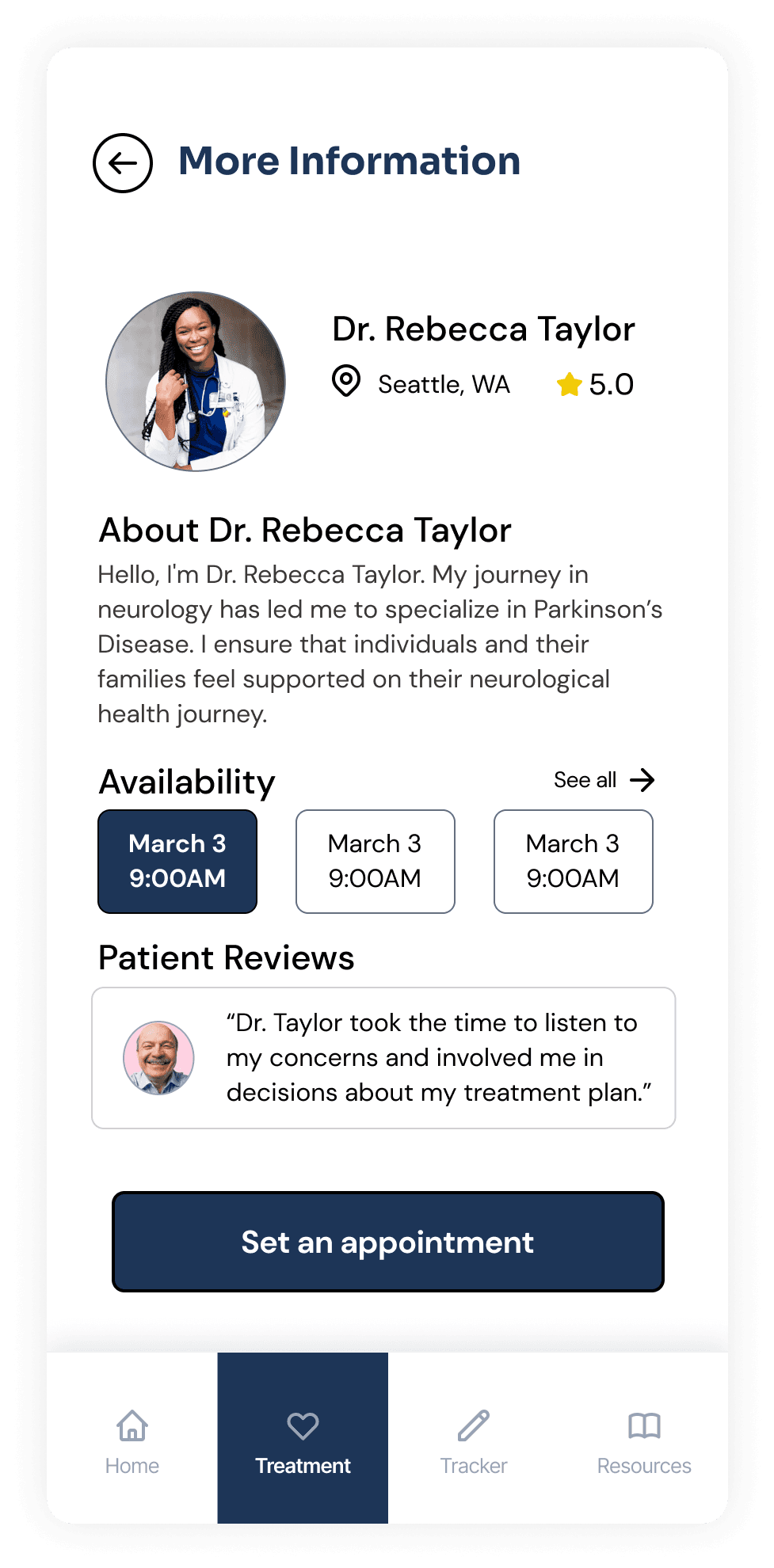
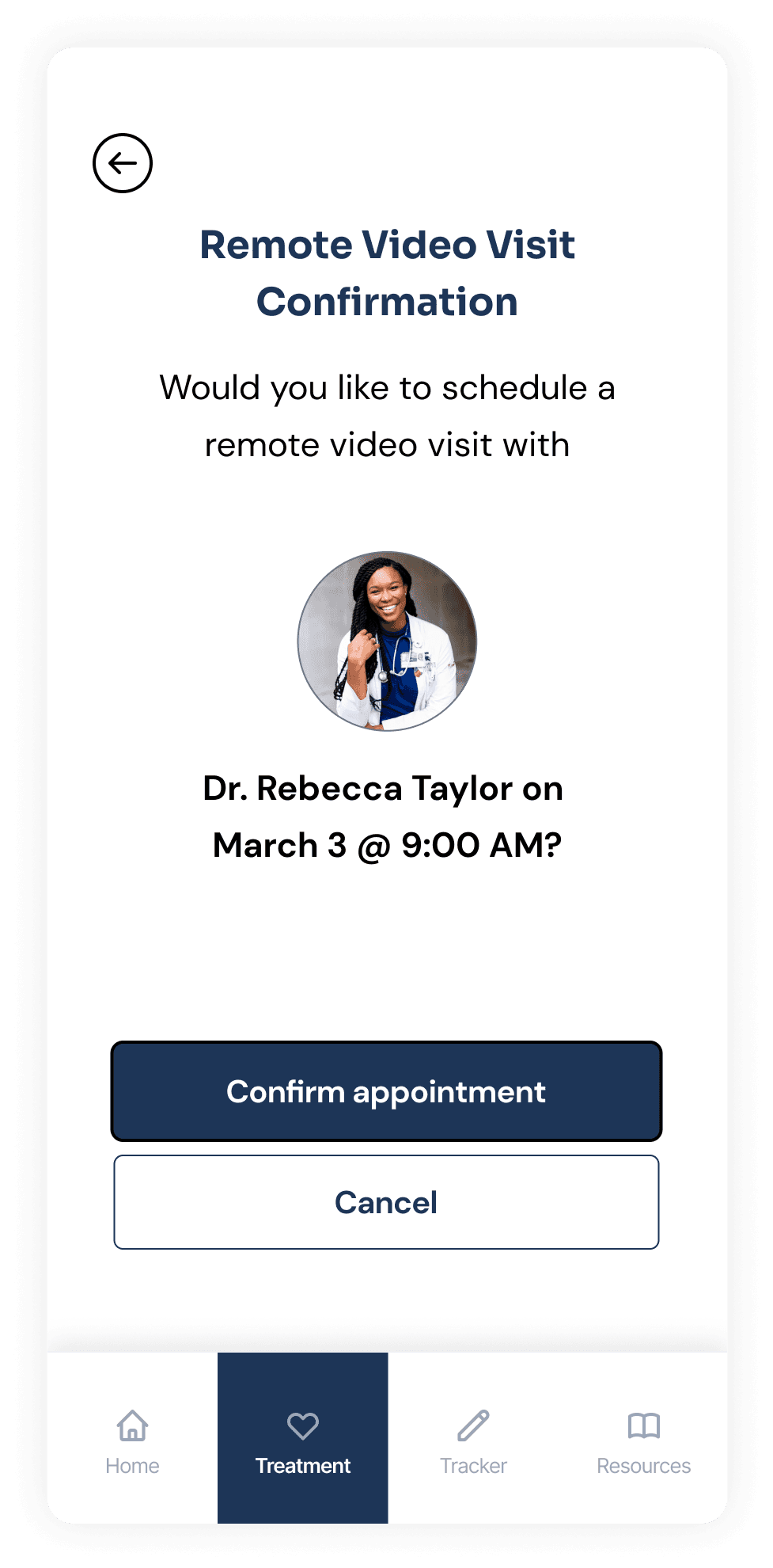
Slideshow: High-Fidelity Screens
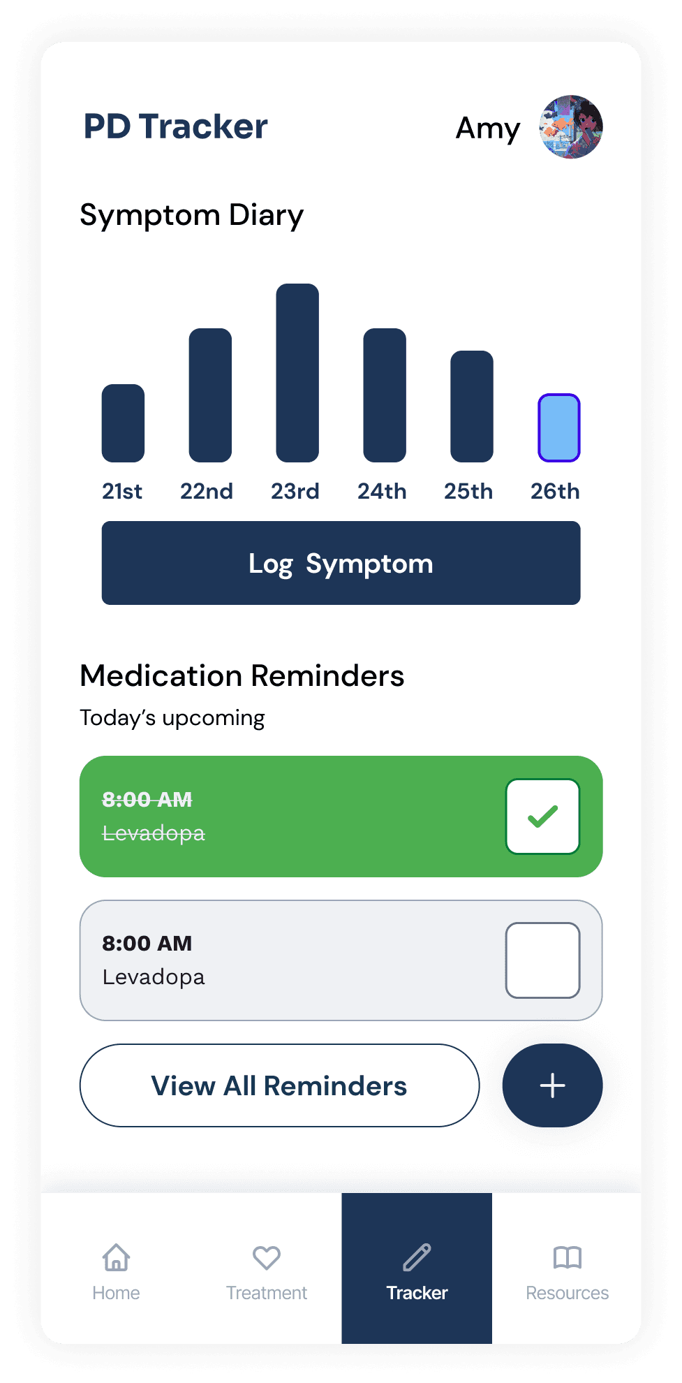
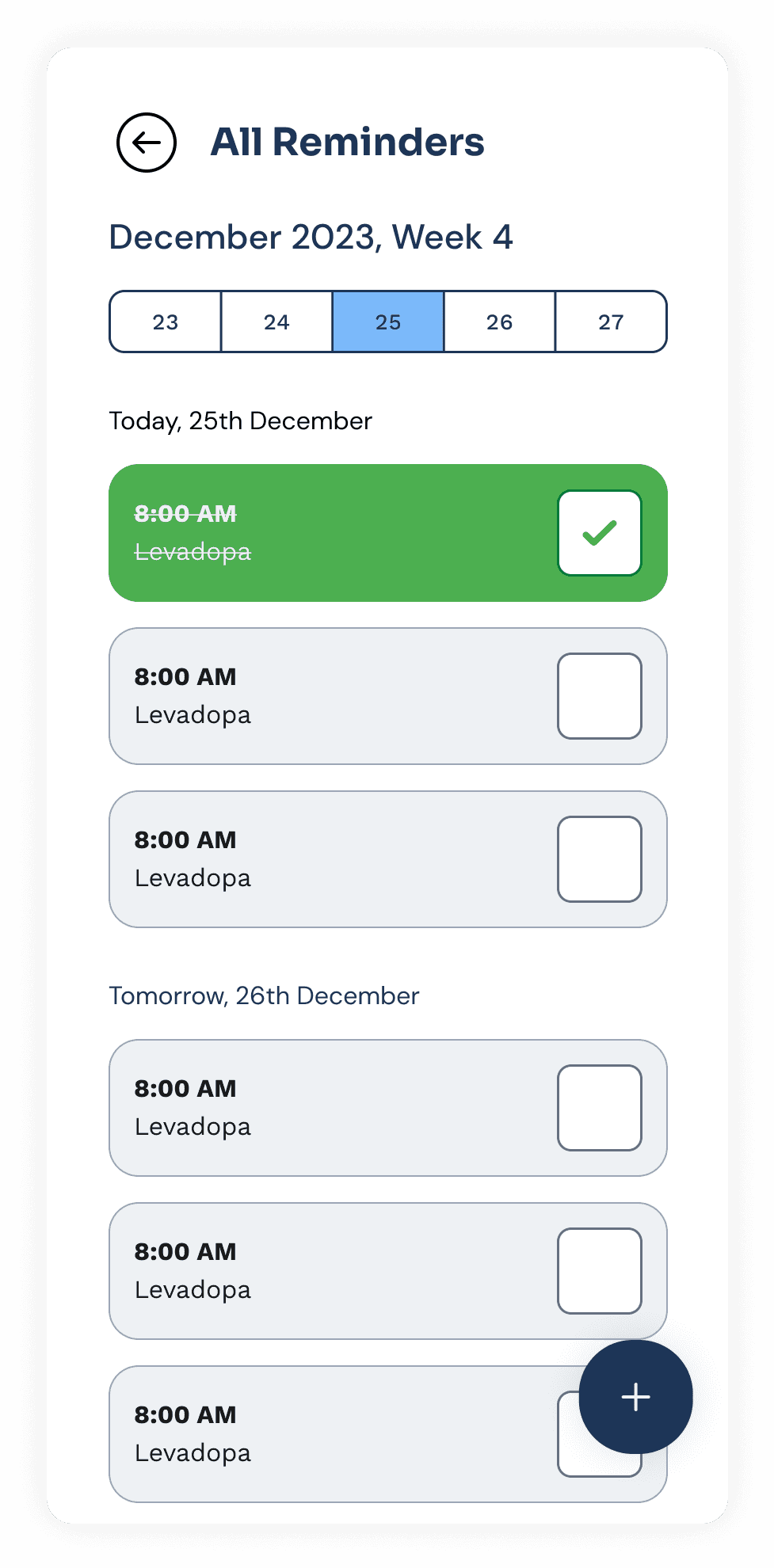
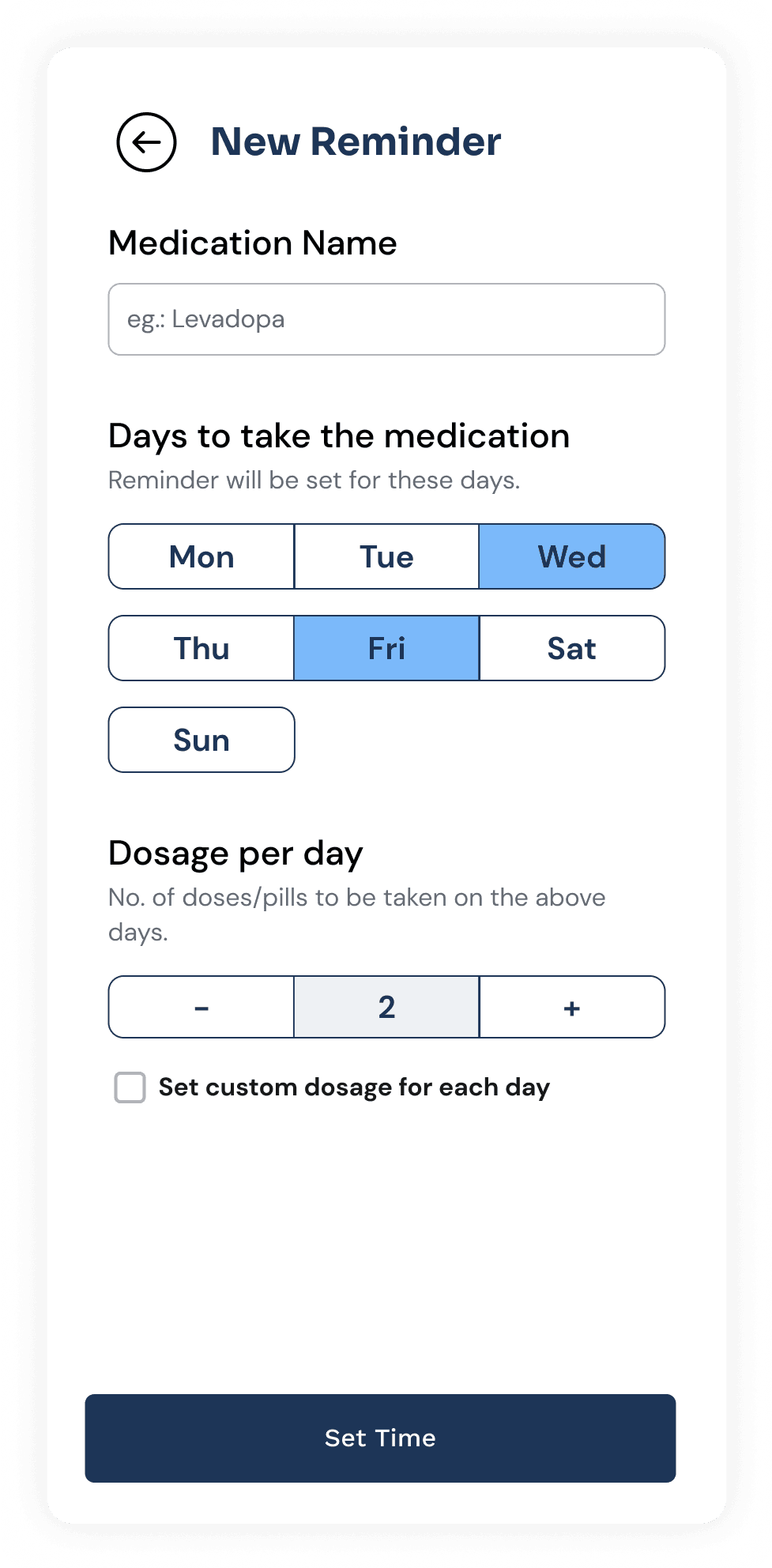
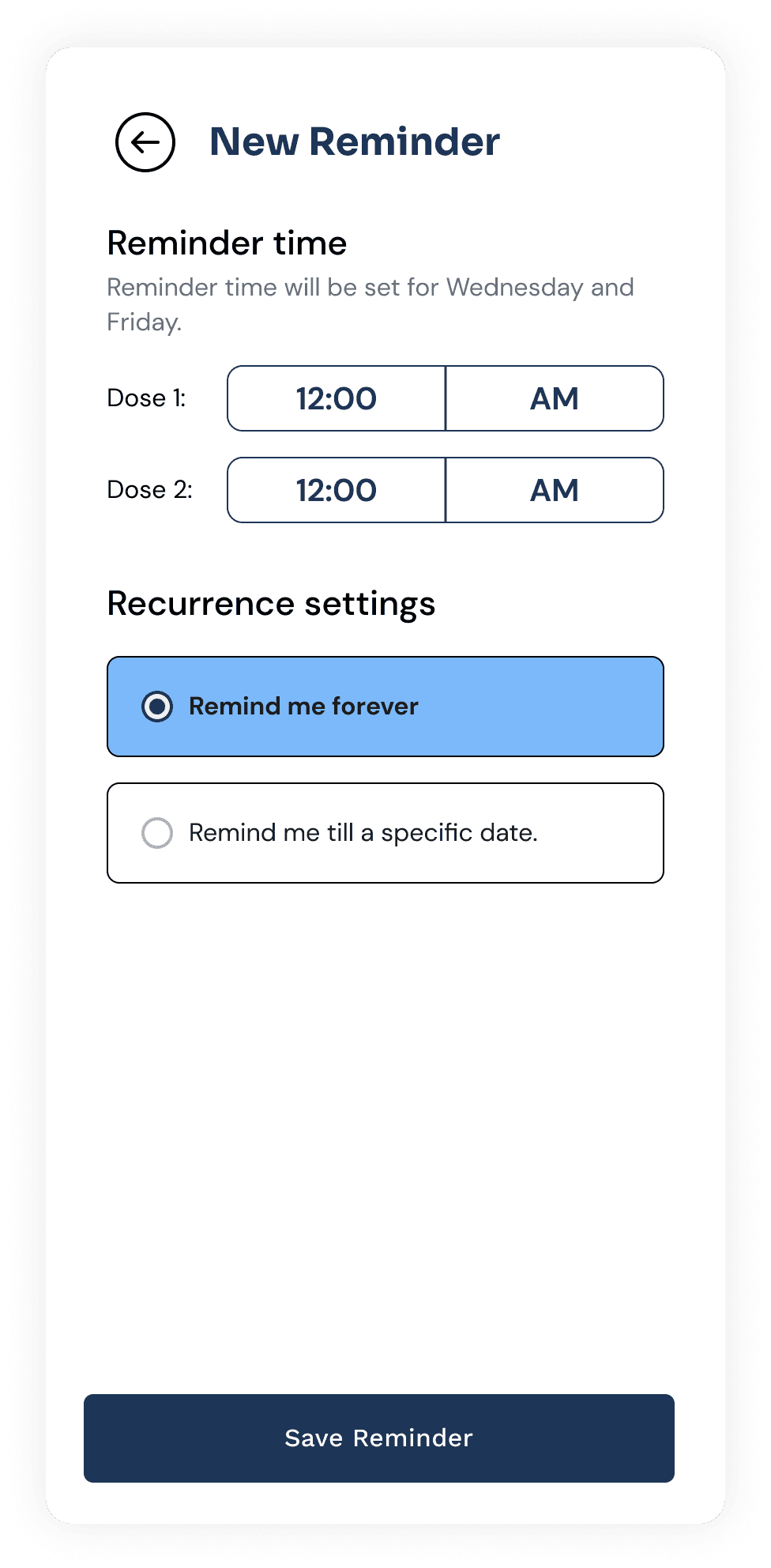
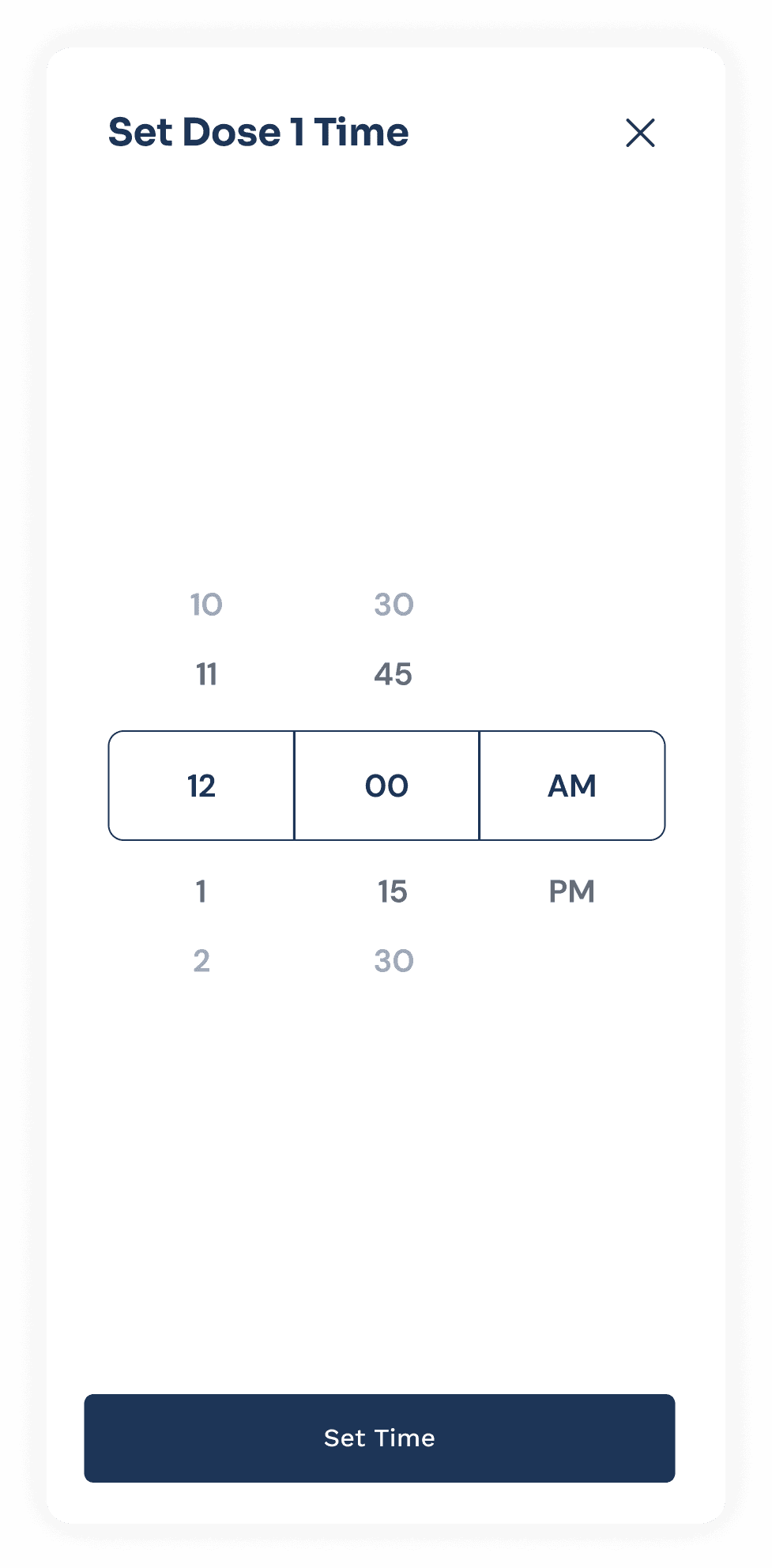
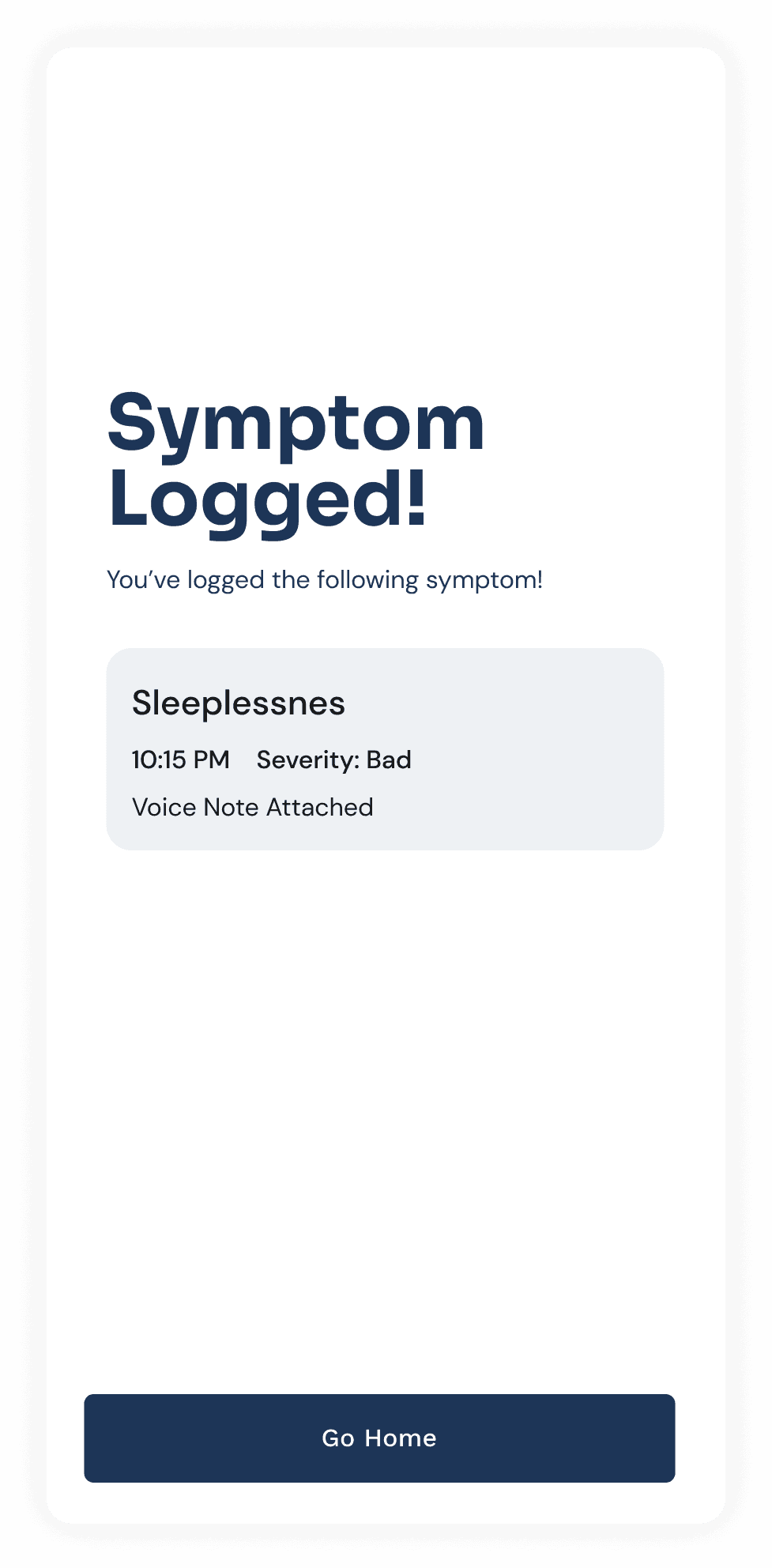
10.2 Symptom and medical intake tracking
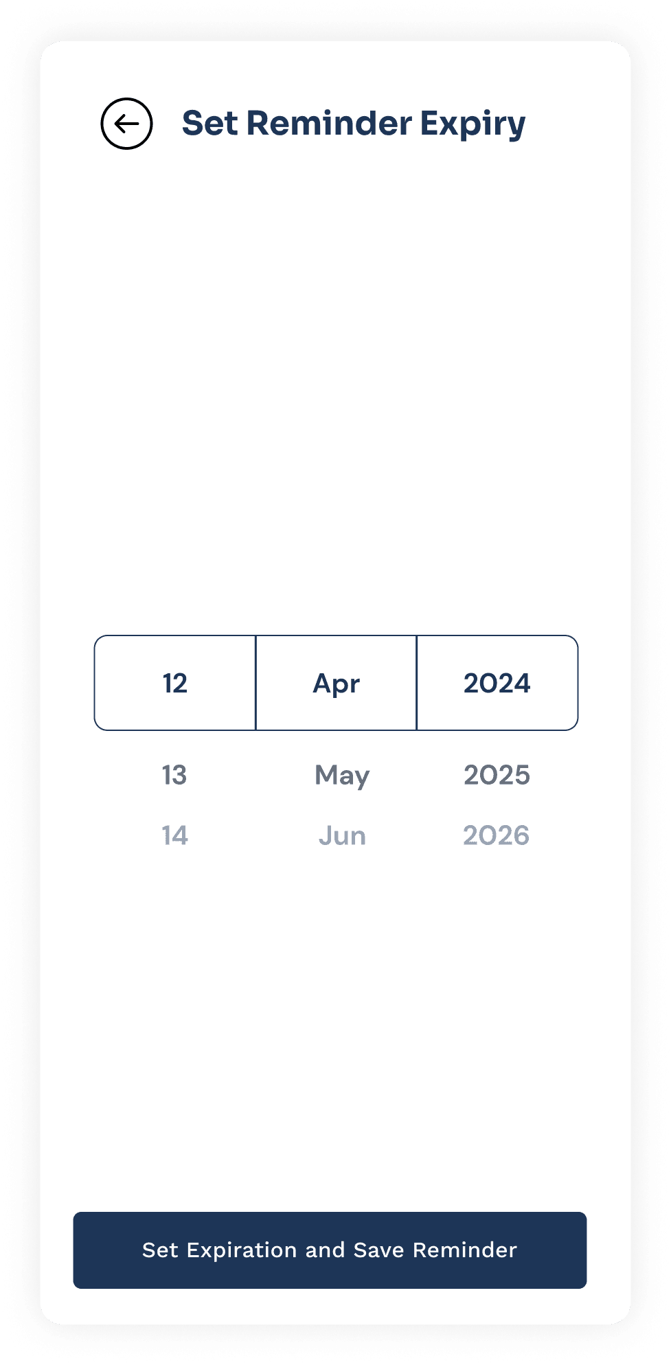
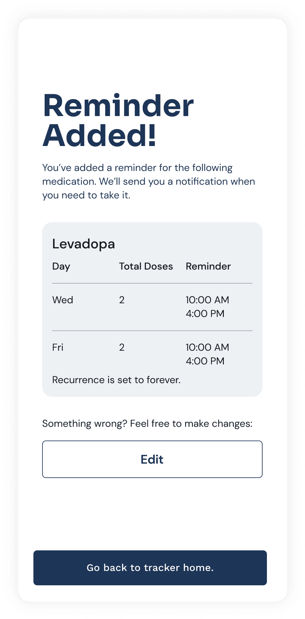
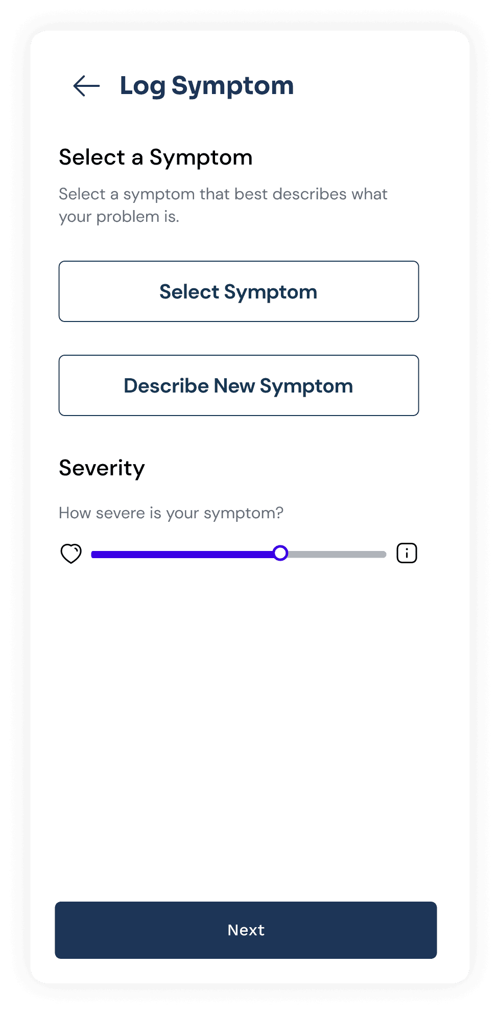
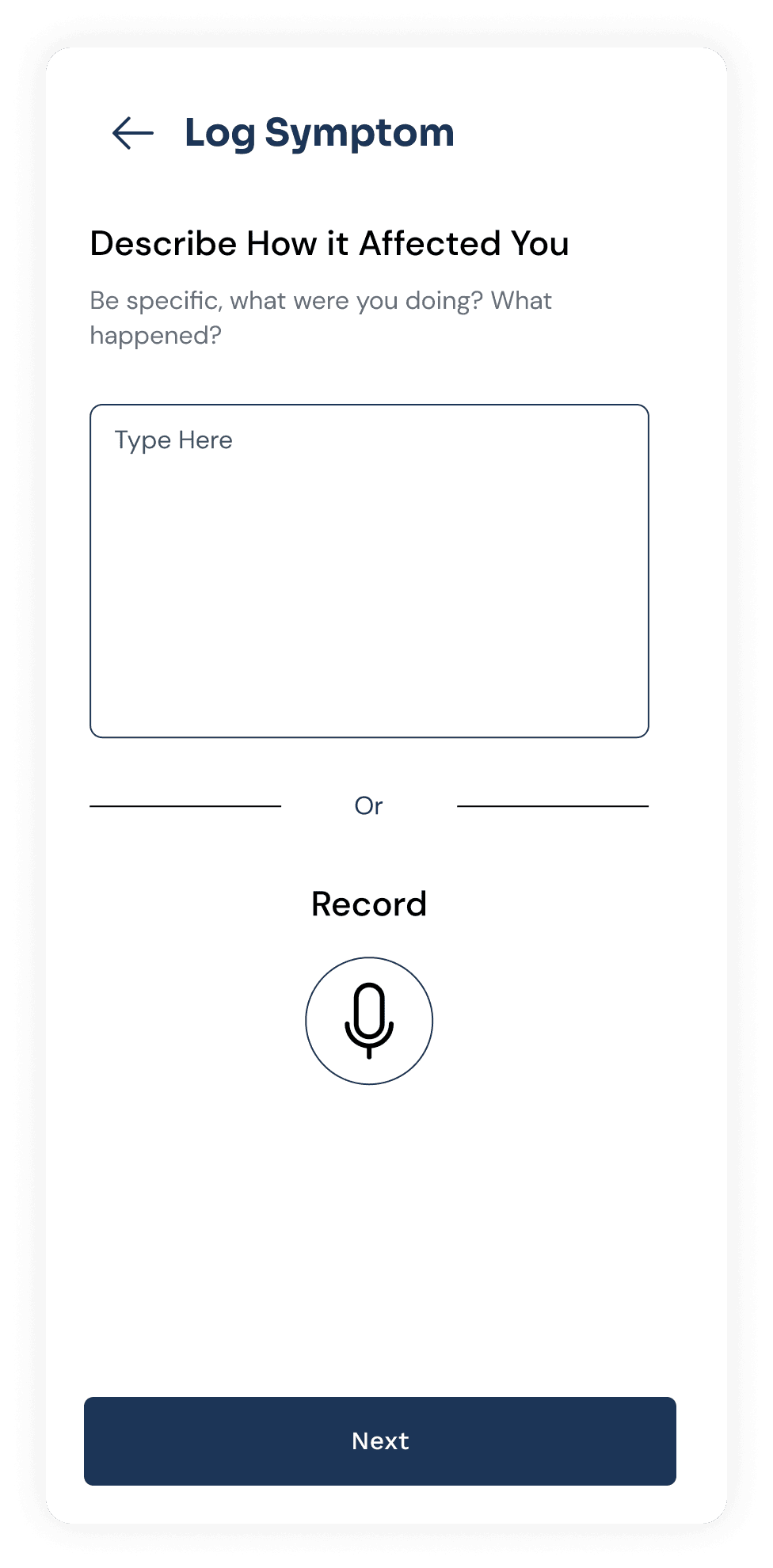
This feature enables patients to track their medication by setting daily reminders and adding an expiry date. It also includes a diary-like interface for symptom tracking.
Slideshow: High-Fidelity Screens
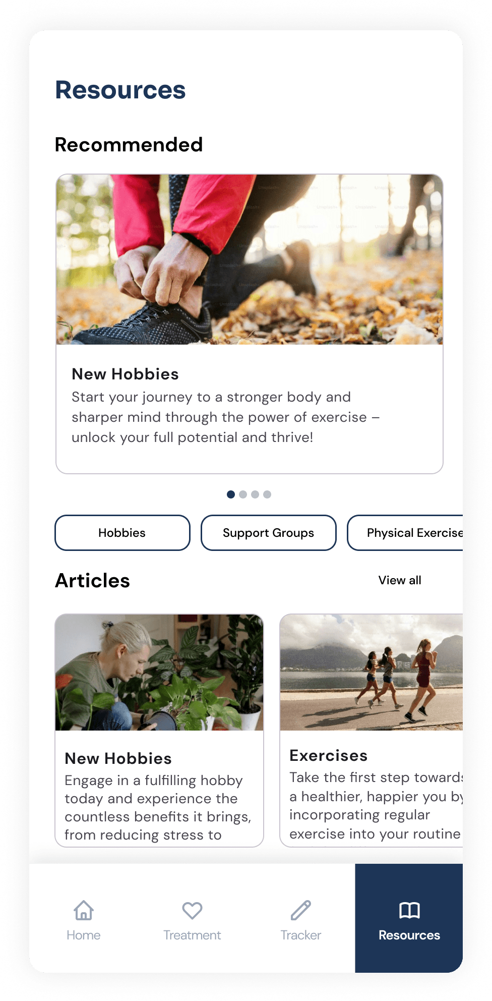
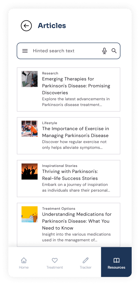
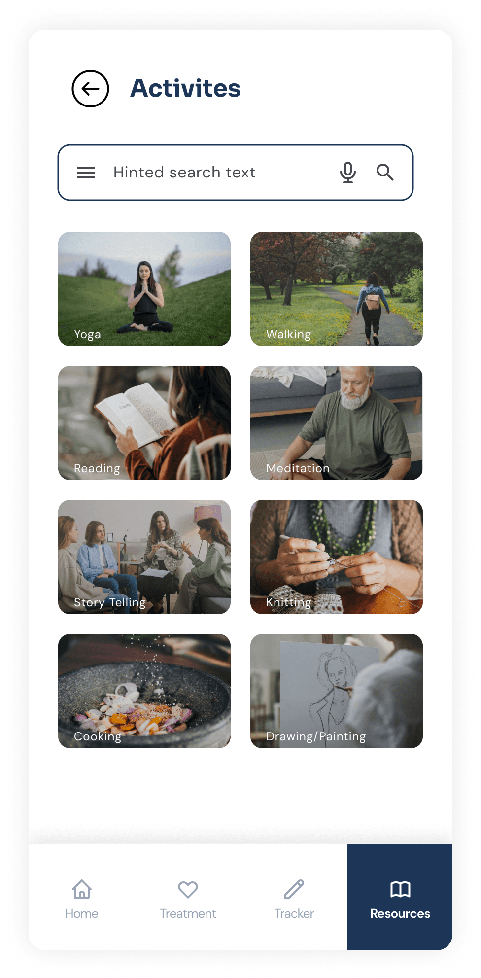
10.3 Resources for treatment
Resources from trusted sources are made available to patients, serving as a centralized hub to access tools that support their physical and mental well-being. These resources are further personalized by linking them to the prescription provided during the initial consultation.
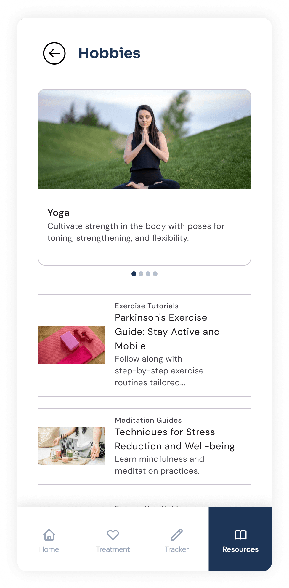
Slideshow: High-Fidelity Screens